
Hi! I'm...
Welcome to my Portfolio!
Featured Work
What type of work can you expect to see?


About Me
A little bit about who I am
Hi, I’m Katie! I am a 2026 BA (Hons) Graphic Design graduate looking for a post graduate job to take on the role of Junior Graphic Designer.Creativity has always been a part of who I am for as long as I can remember. I have a precise eye for detail, making sure I hit every deliverable to a high standard, specialising in editorial design, typography and layout. I work both digitally and physically, making me capable for adapting to each individual project. Due to working within a studio environment for the past three years, I have gained a strong sense of teamwork, understanding and communication, as well as a good idea on what makes me standout amongst other designers.Outside of design, I love to spend time with friends and capturing every moment through photography. I always stay intrigued by my surroundings, finding small details wherever I go.I am obsessed with music (I am constantly listening to something) and am a HUGE geek when it comes to all things Star Wars. As well as music, I spend a lot of time playing video games (Minecraft will forever stay at No. 1 spot). This love for different forms of media directly fuels my love for Graphic Design and this spark continues
to grow as I observe and learn new things.
Qualifications & Awards
Things I have achieved!
Adobe ACA Exams
Work
A range of projects I have worked on and
completed over my however many years
as a Graphic Designer.


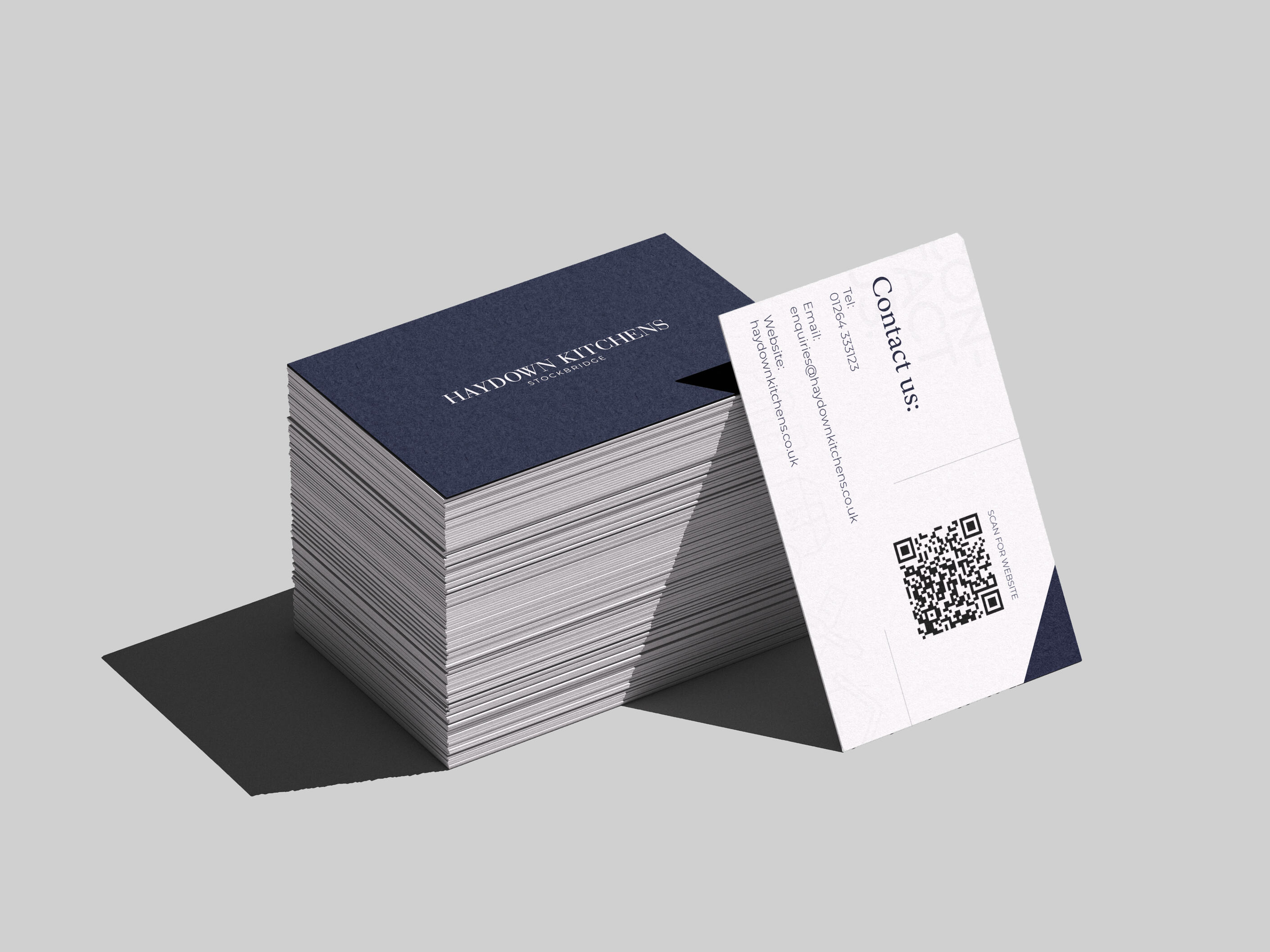
Contact
Please feel free to get in touch, I would love to hear from you!
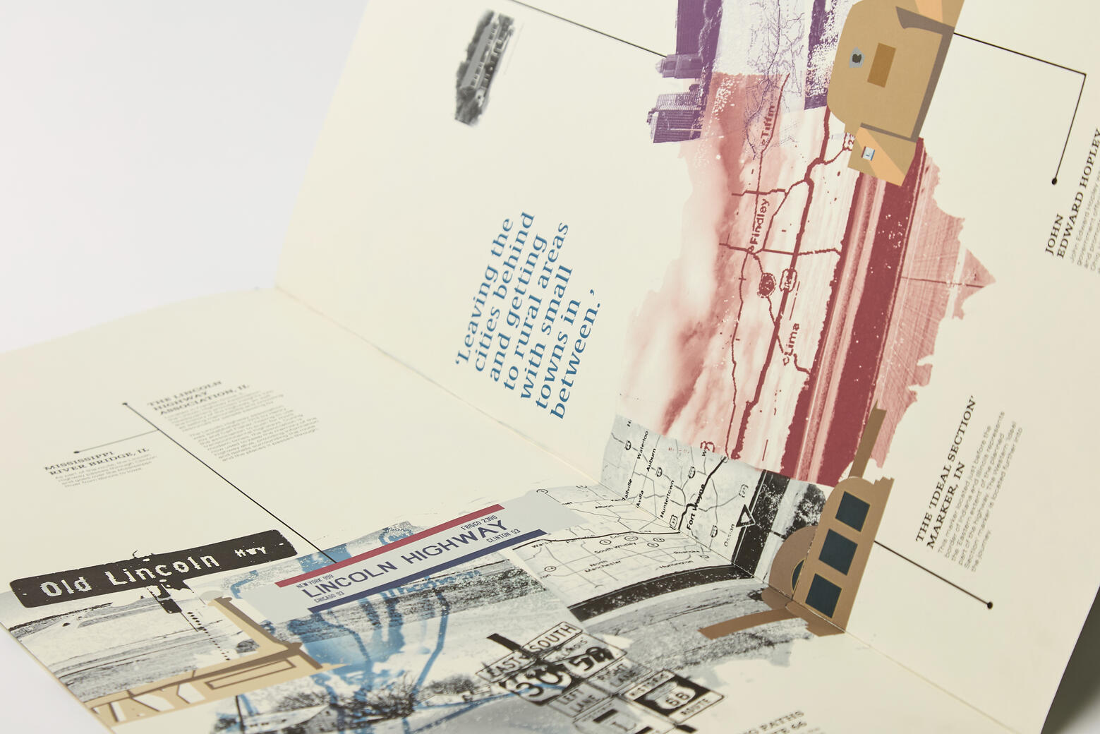
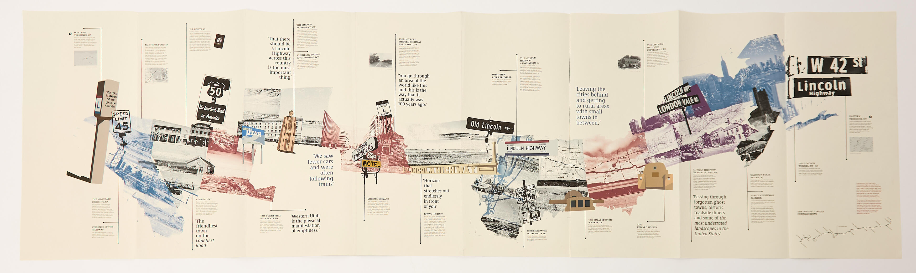
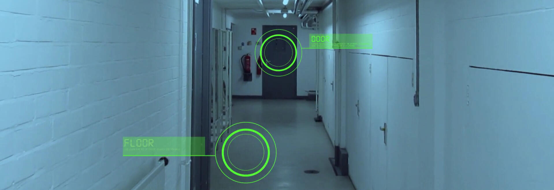
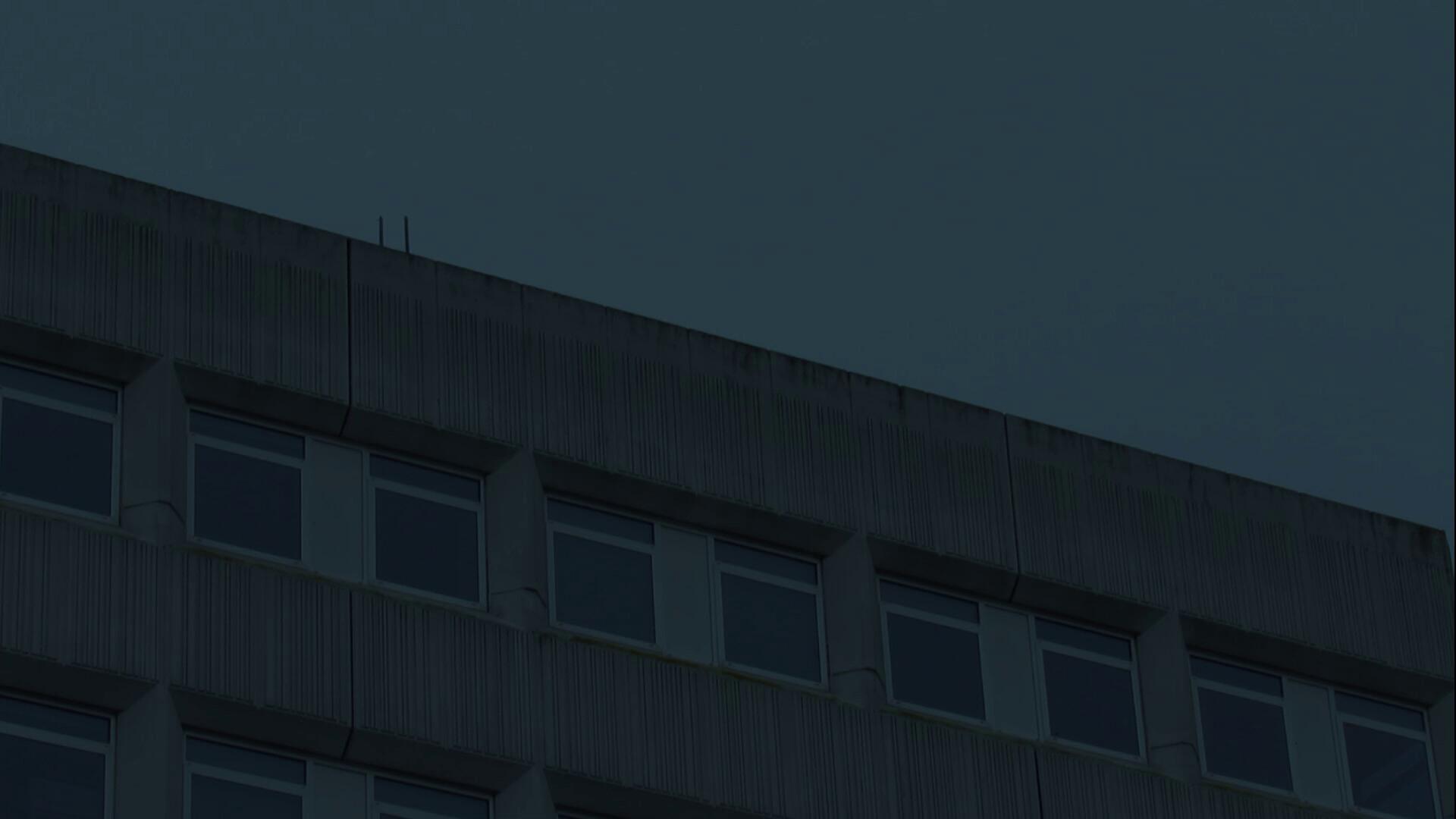
Final Major Project
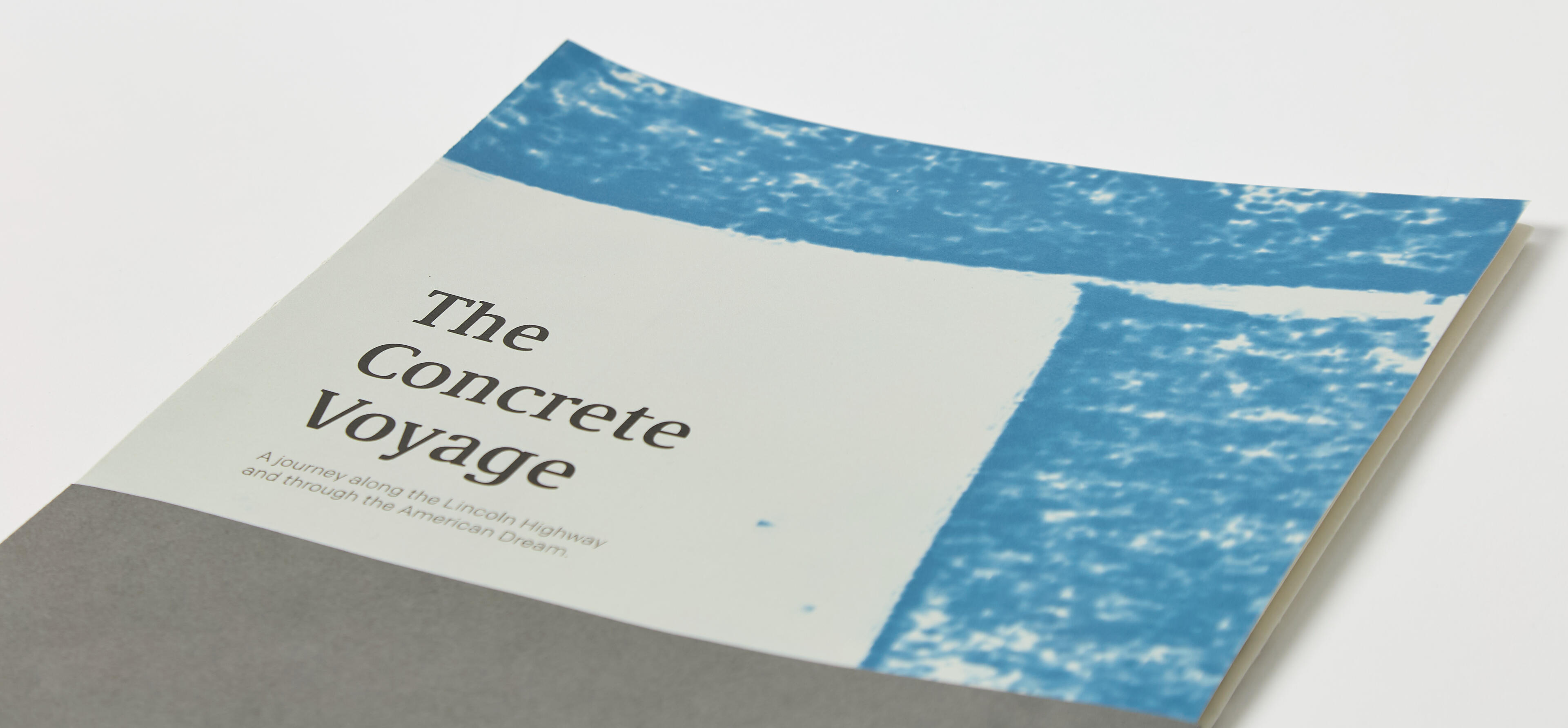
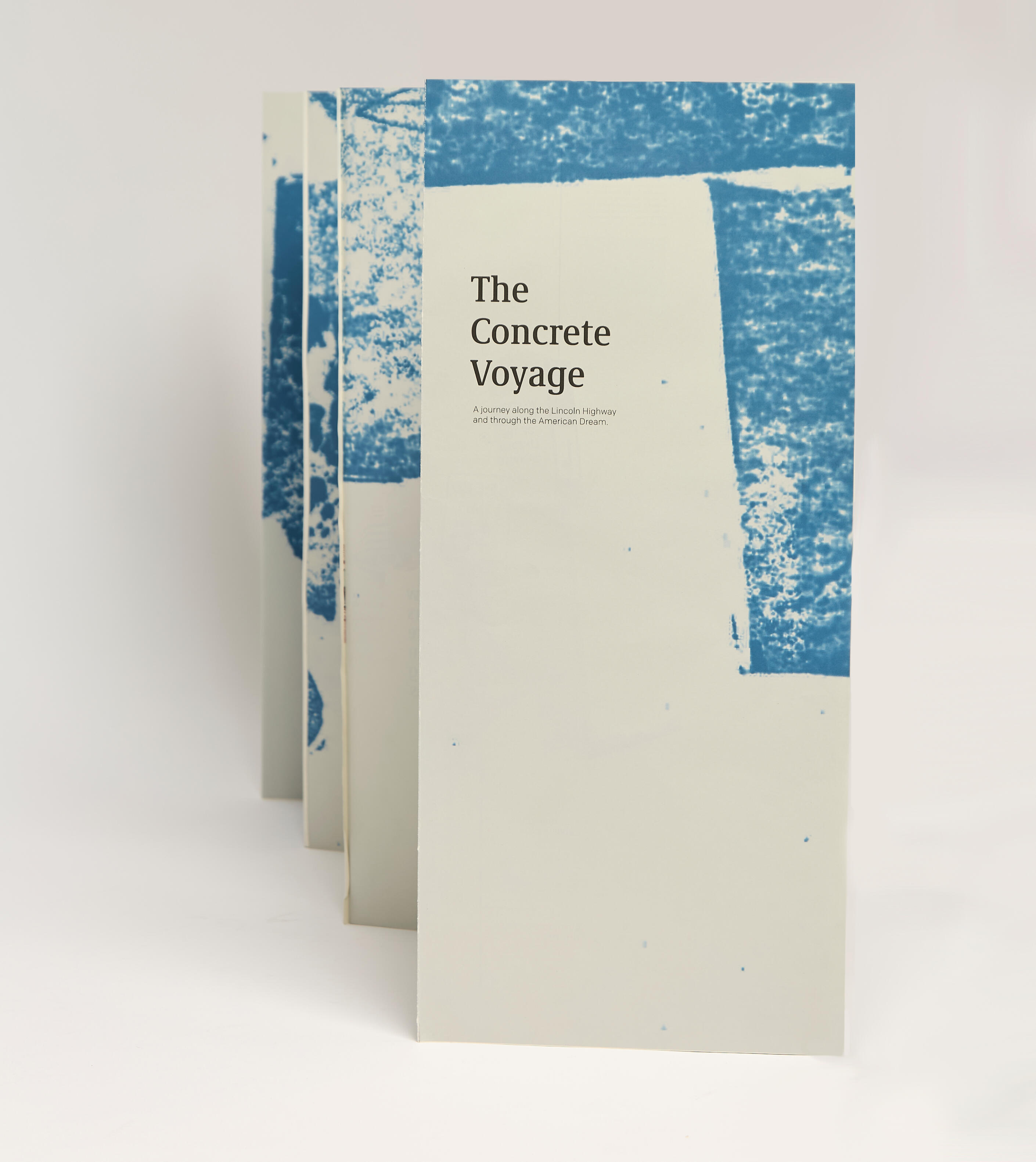
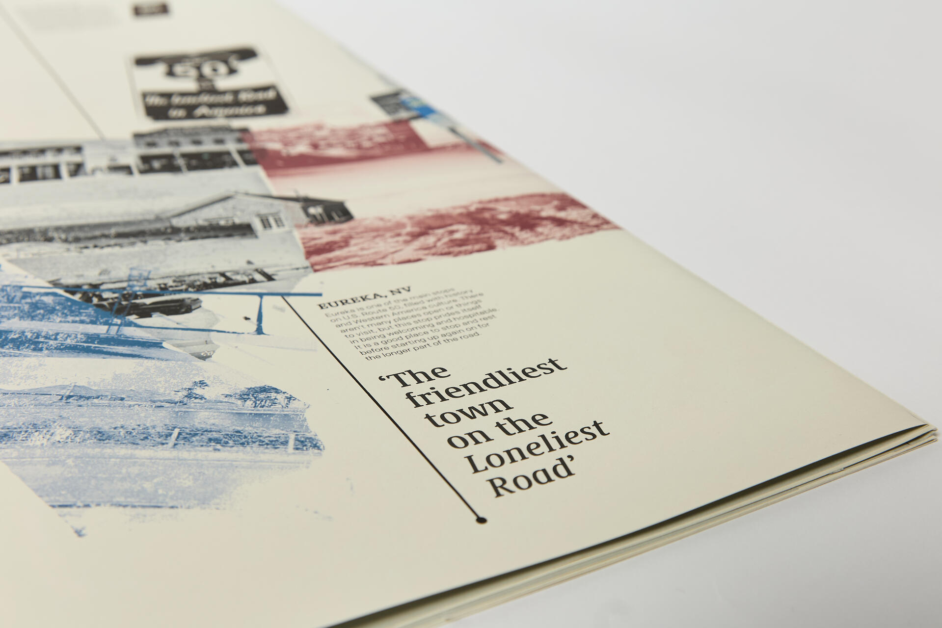
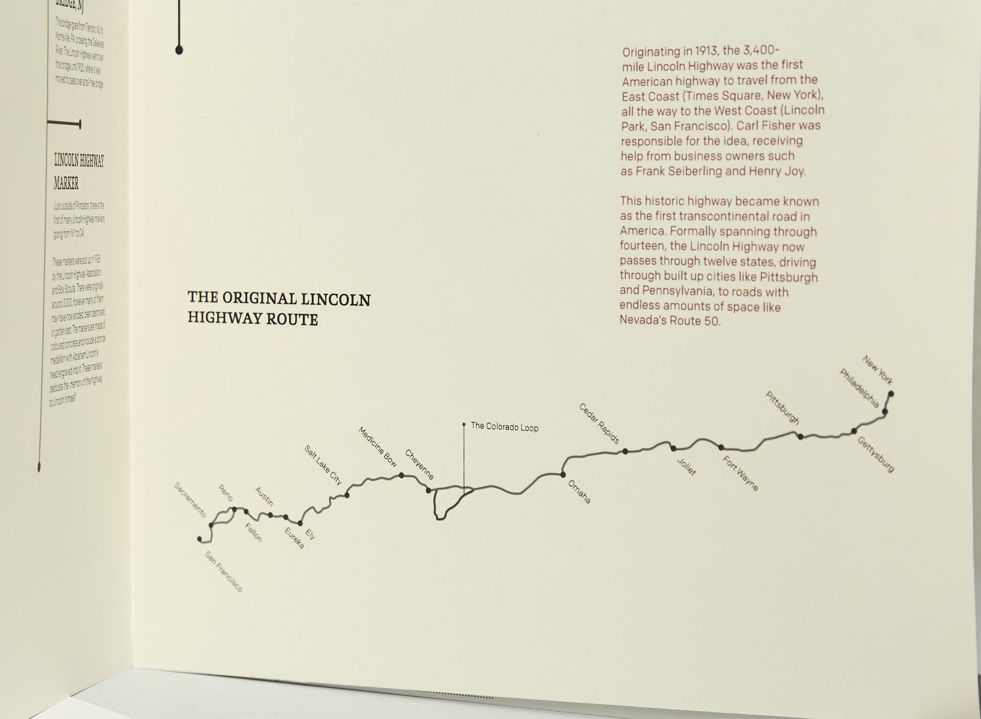
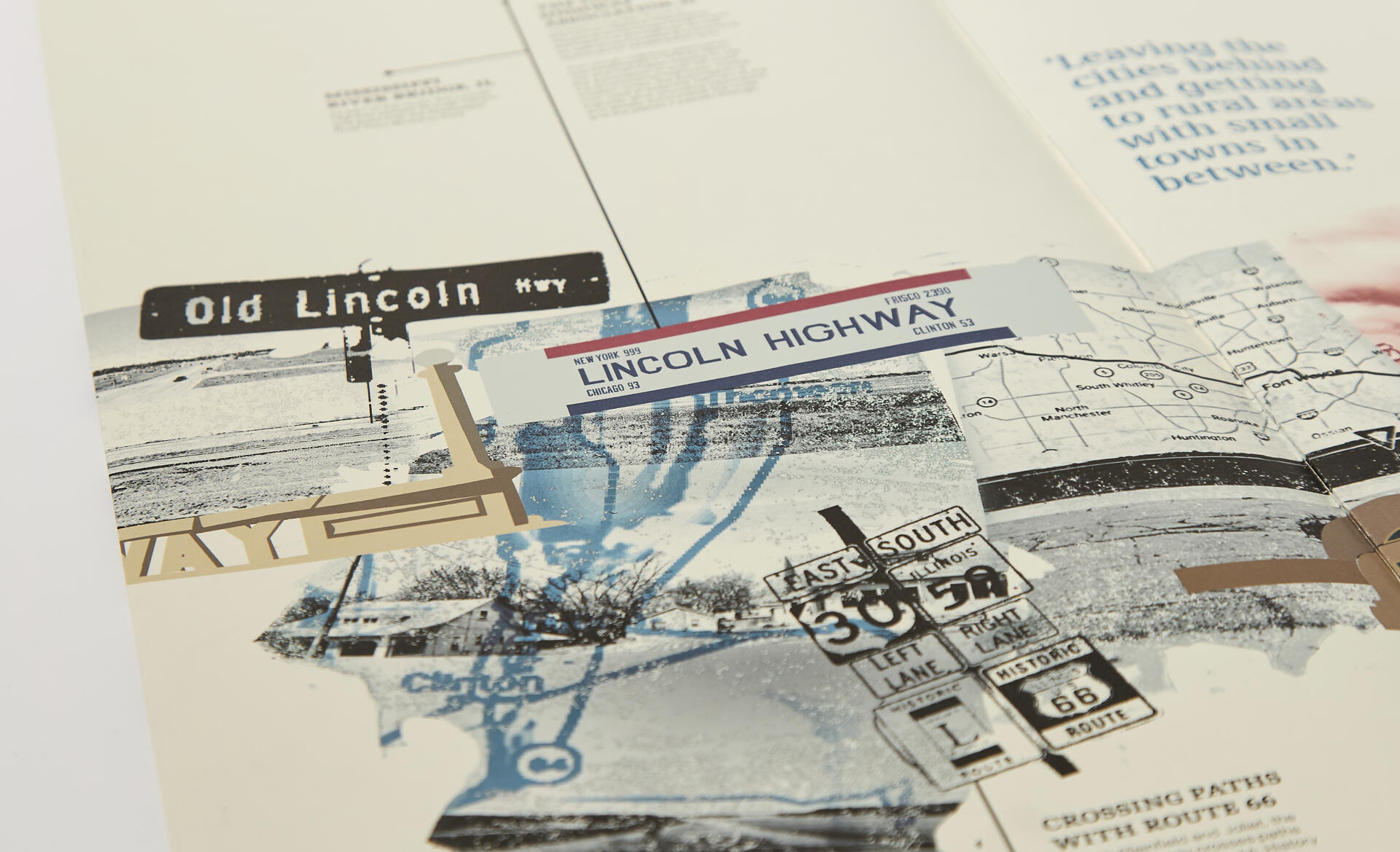
The Concrete Voyage
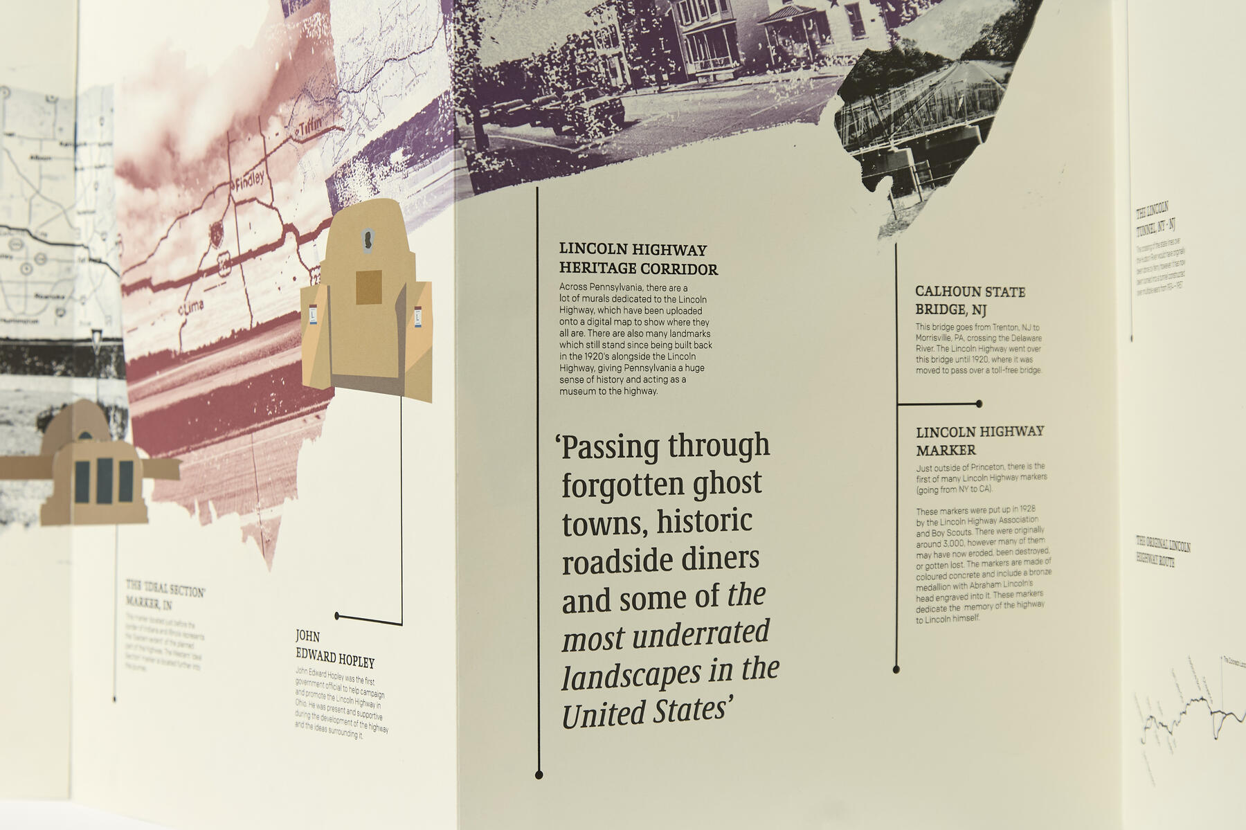
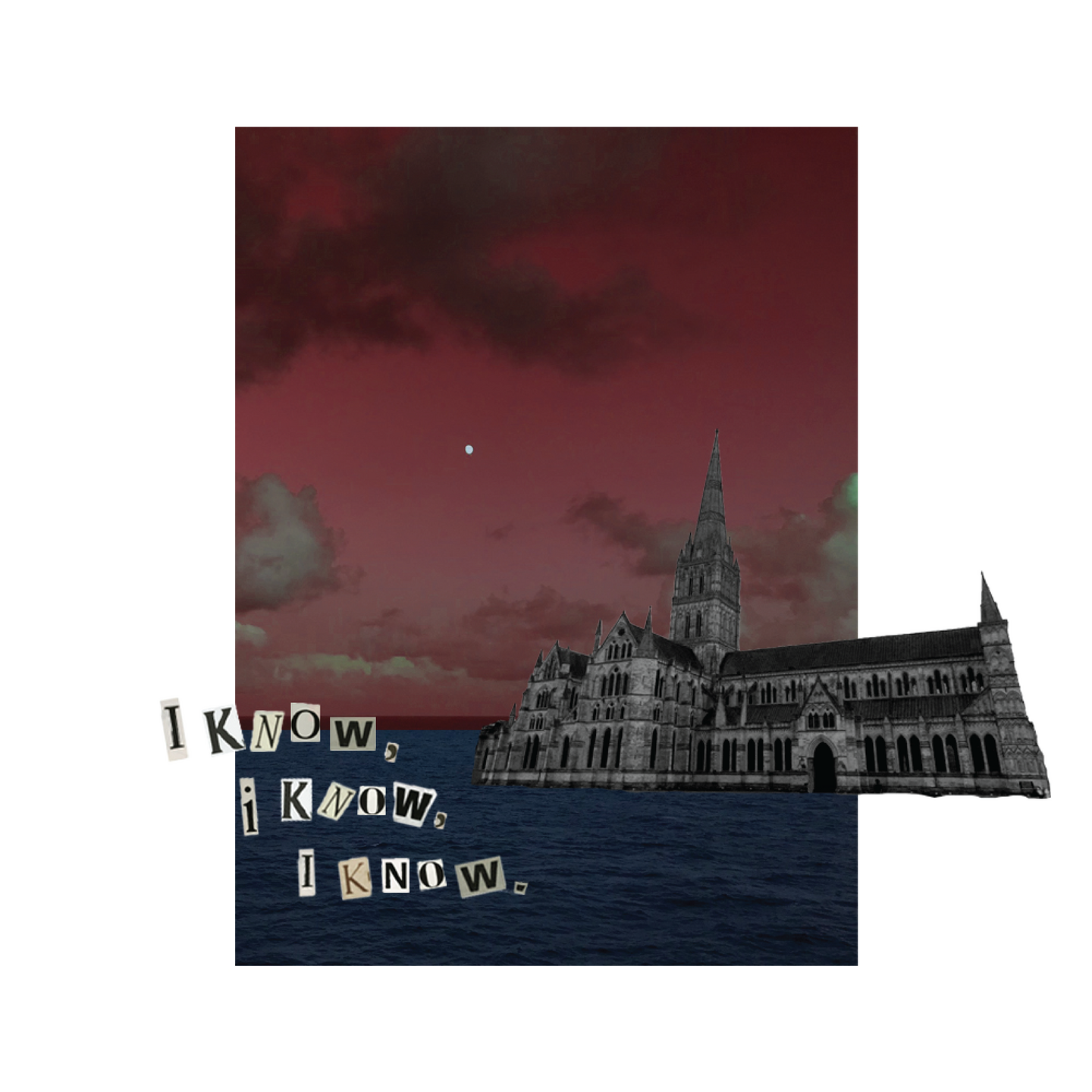
For my final project in my Graphic Design degree, I was given the opportunity to take full control over my journey and design process.My research began with my interest in American architecture, diving into the different areas of the country and how they were represented within the buildings. I am very into photography and the side to the American Dream which focuses on the beauty and lost culture, rather than the political elements. A breath of fresh air, if you will.After coming across Jack Kerouac’s ‘On the Road’, I discovered the astonishing and underrated Lincoln Highway – the first transcontinental highway in America spanning from the East Coast (New York) all the way to the West Coast (San Francisco). After many rabbit holes, I knew I had to bring to light this part of history, and I knew I had to make something which does it justice.I began with the idea of displaying the journey through each of the 12 states, which then turned into creating a 210cm-long concertina. I used images I had sourced within the design, using linocut stamps as a mask which resulted in a dream- like feel. This journey was displayed in a timeline layout, including all the information associated with the different landmarks and points of interest along the route.‘Concrete Voyage’ refers to the endless rural countryside of America acting as the ‘sea’ and the random towns/cities you come across as the ‘islands’. I wanted to portray the vastness of the country and how it feels like an endless journey – an endless voyage. I learnt a lot about myself as a designer during this project, and it allowed me to understand the design process’ you must go through before coming to the final result. It allowed me to bring to light something which was less well known, and gave me a huge canvas to showcase my passion for typography and layout, as well as my nerdy interest into American highways, landscapes, photography and architecture.
Behind the Scenes and the Creative Process
ISTD Competition
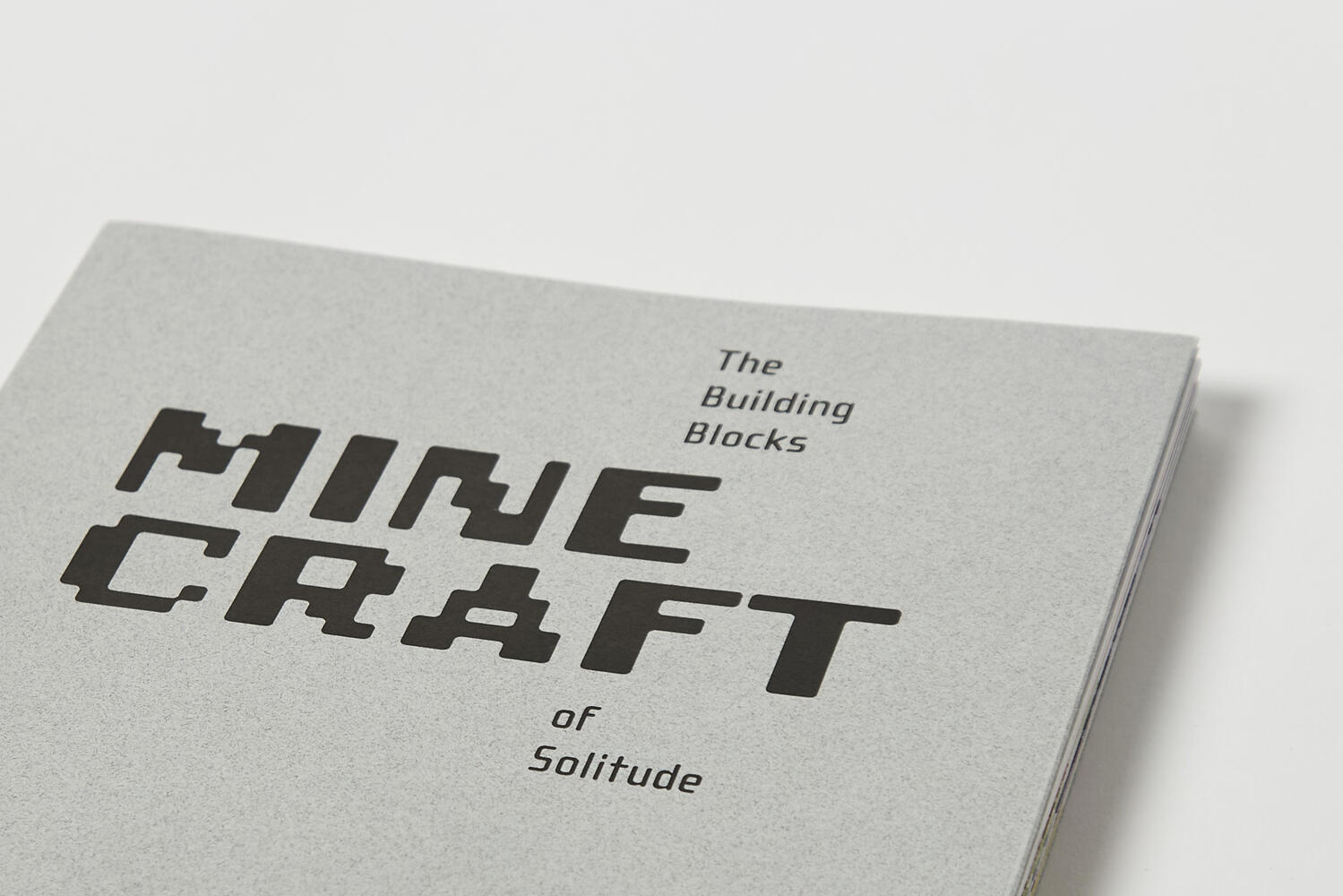
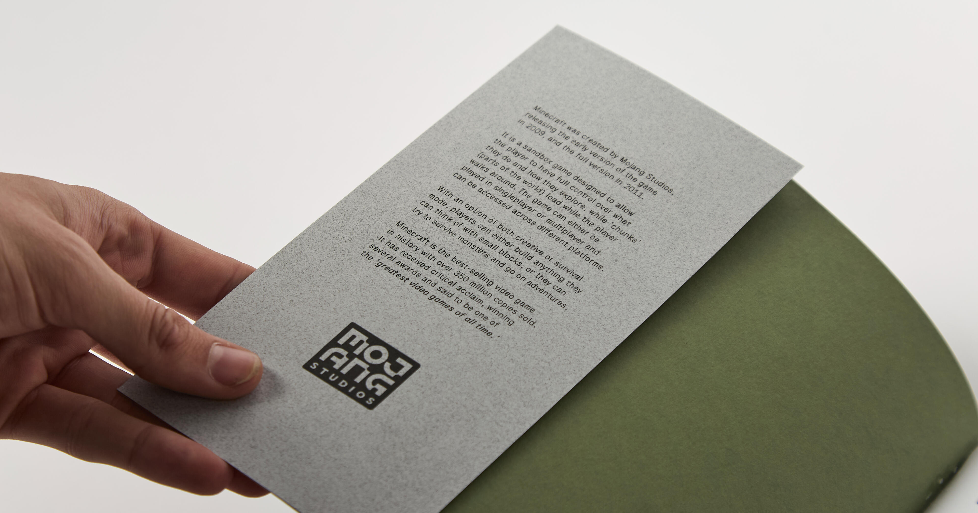
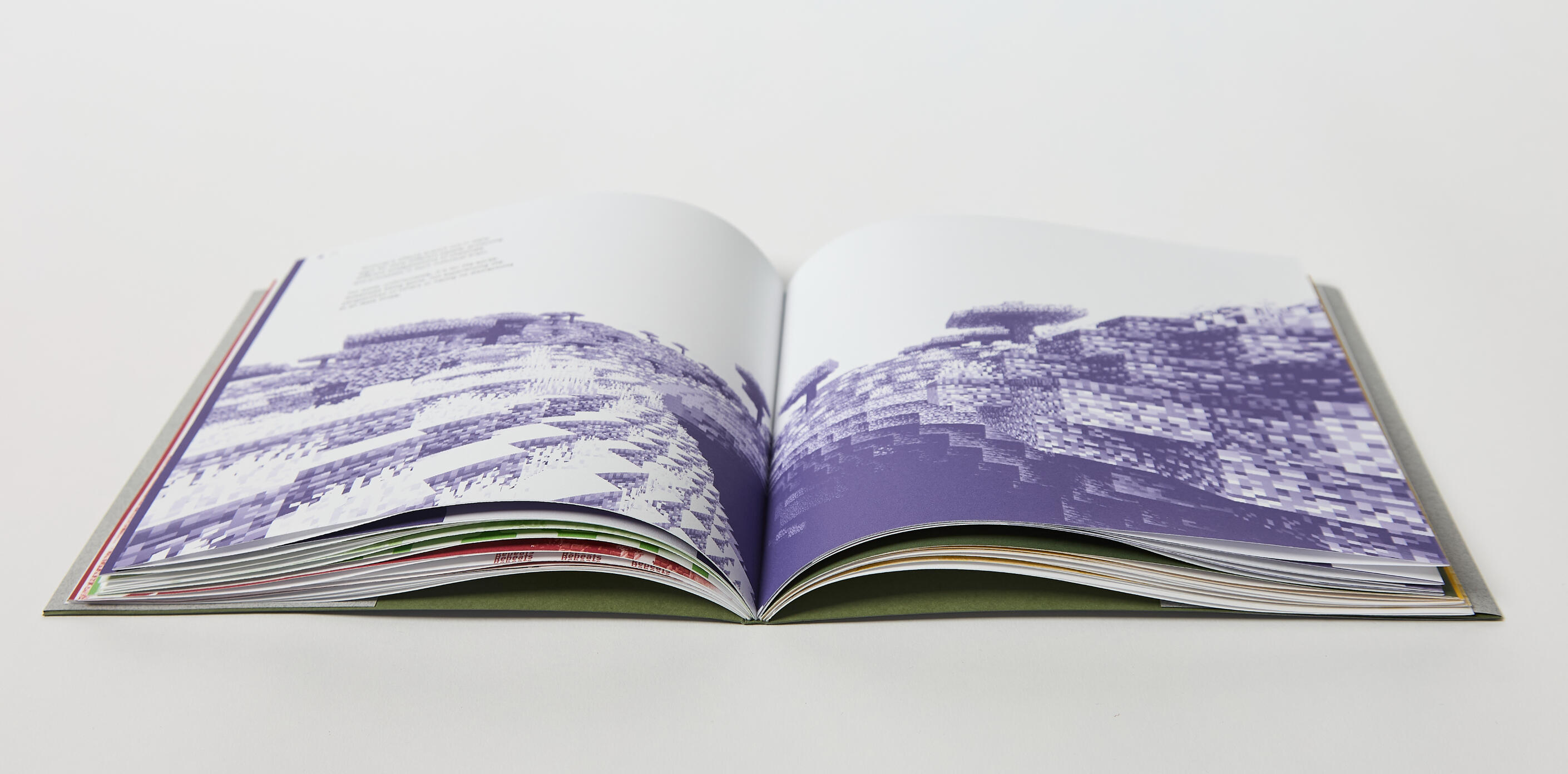
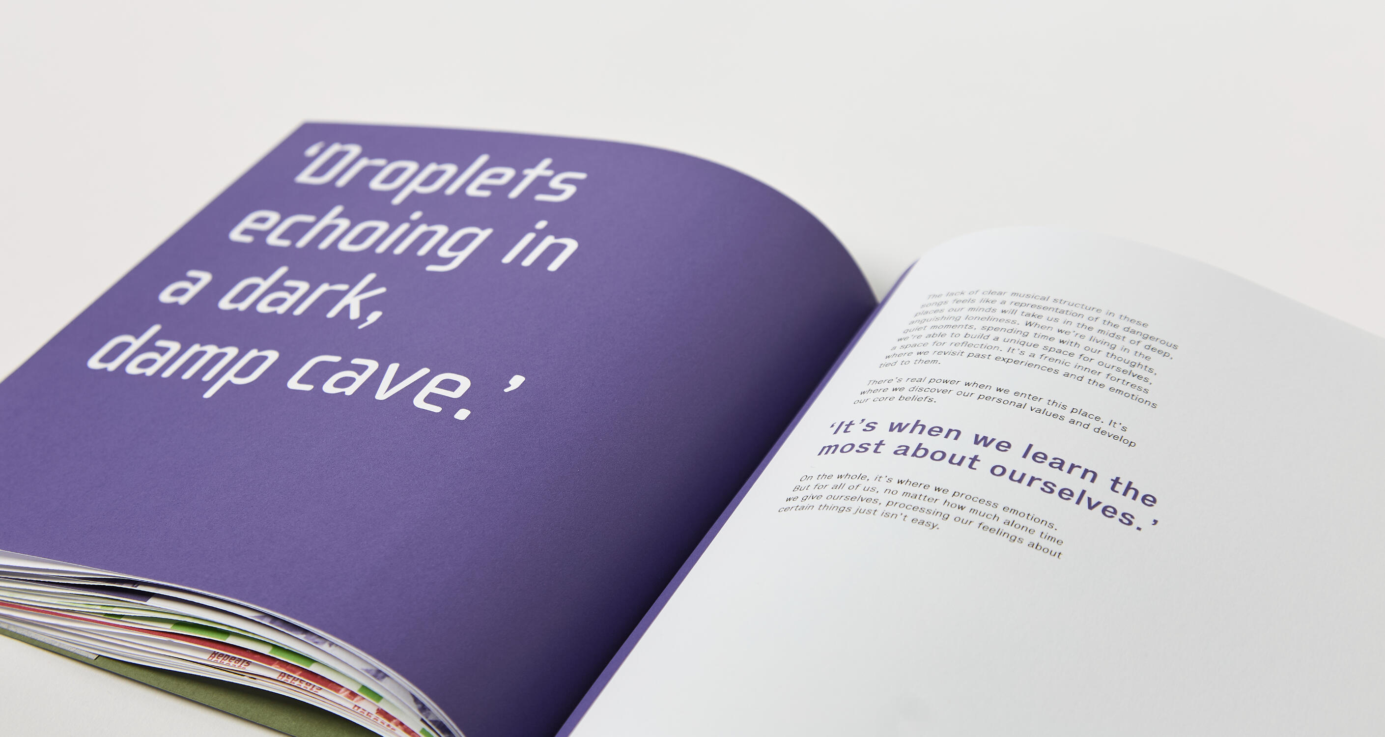
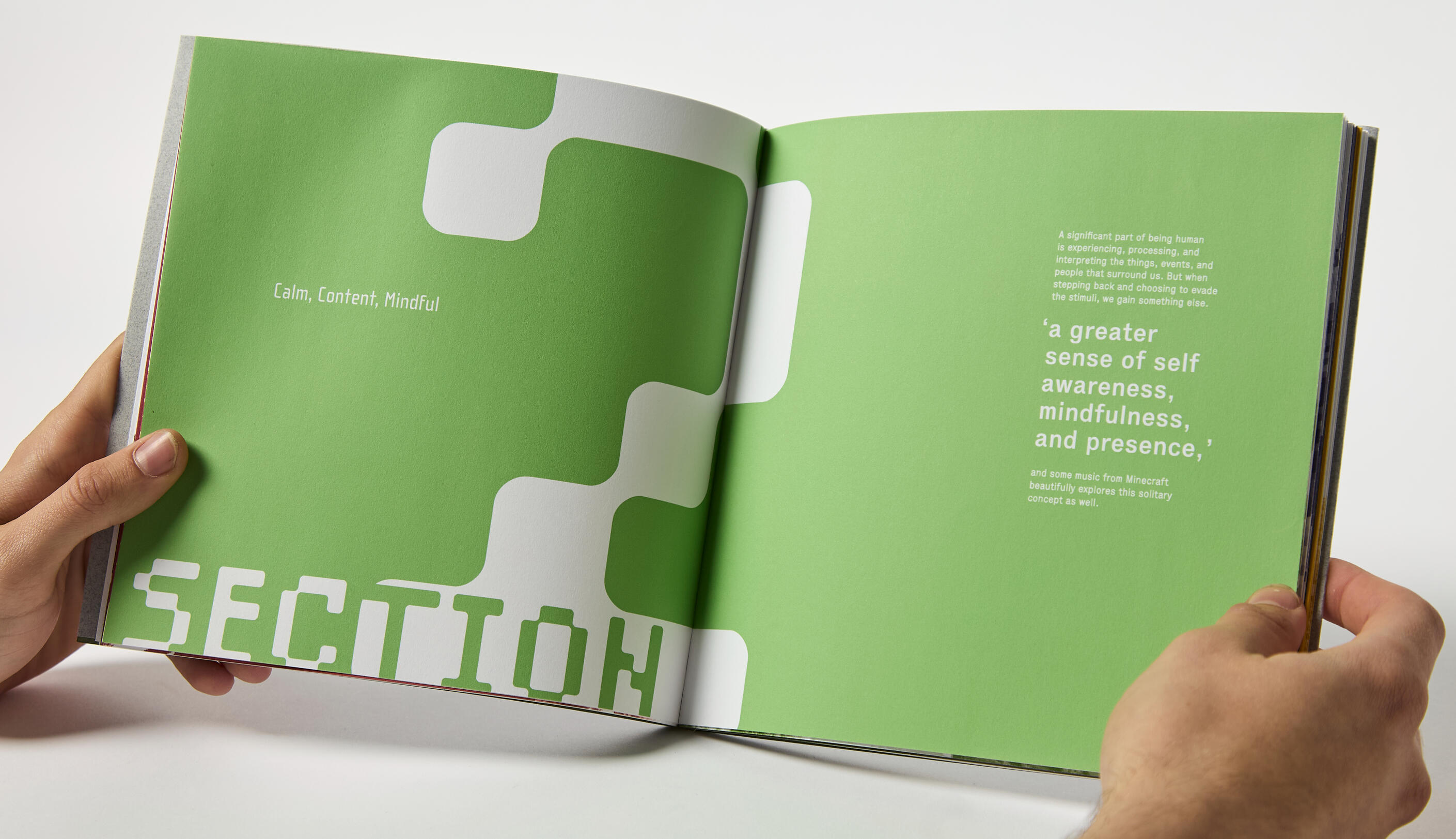
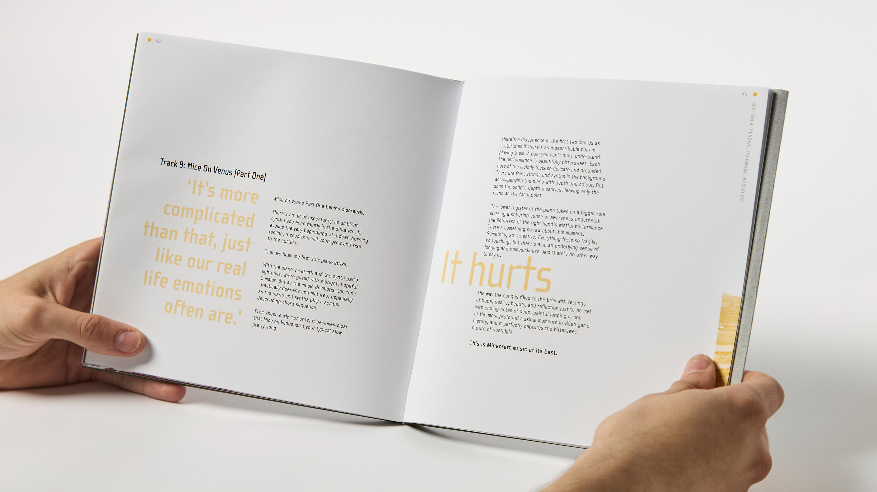
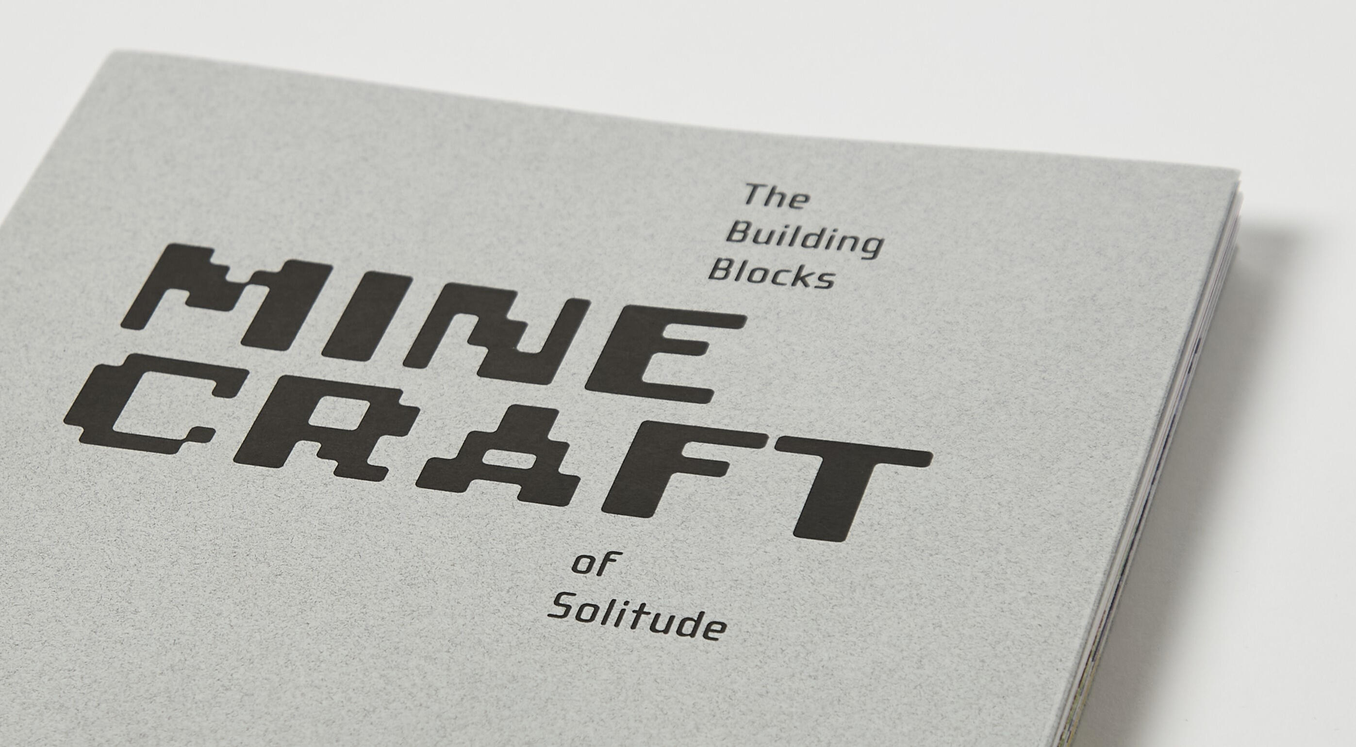
Minecraft: The Building Blocks of Solitude
After choosing the brief ‘Power’, my aim for this project was to showcase the power of the Minecraft soundtrack and how it is a clear example of a familiar tough feeling – solitude. After the full game was released in 2011, Minecraft has had a big impact on a lot of teens and young adults. This video game is full of endless possibilities and places to explore, but it holds such a heavy feeling of longing, nostalgia and reflection, and the soundtrack conveys that exact same emotion.Within this publication, these emotions and responses to the tracks of Minecraft are highlighted and bought to life through typography, imagery and colour. The book is then split into four main sections with an introduction and conclusion either side. These correlate to emotions within solitude and contain up to three tracks, portraying examples of these feelings. Each track has its own display type and pull-quote which are given room to mirror their sound and power. The fold out in the middle of the book allows for further interactivity and allows the reader to pause, similar to the pauses in the Minecraft soundtrack itself. This publication demonstrates solitude by bringing to life the sound of Minecraft, guiding the reader through difficult feelings and evidencing just how much power the Minecraft soundtrack really has.
Behind the Scenes and the Creative Process
Editorial Design Brief
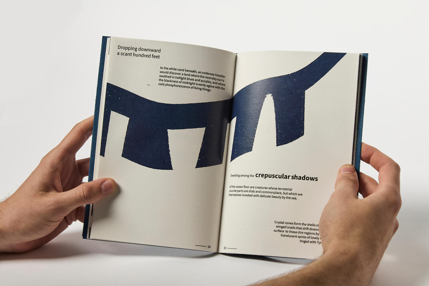
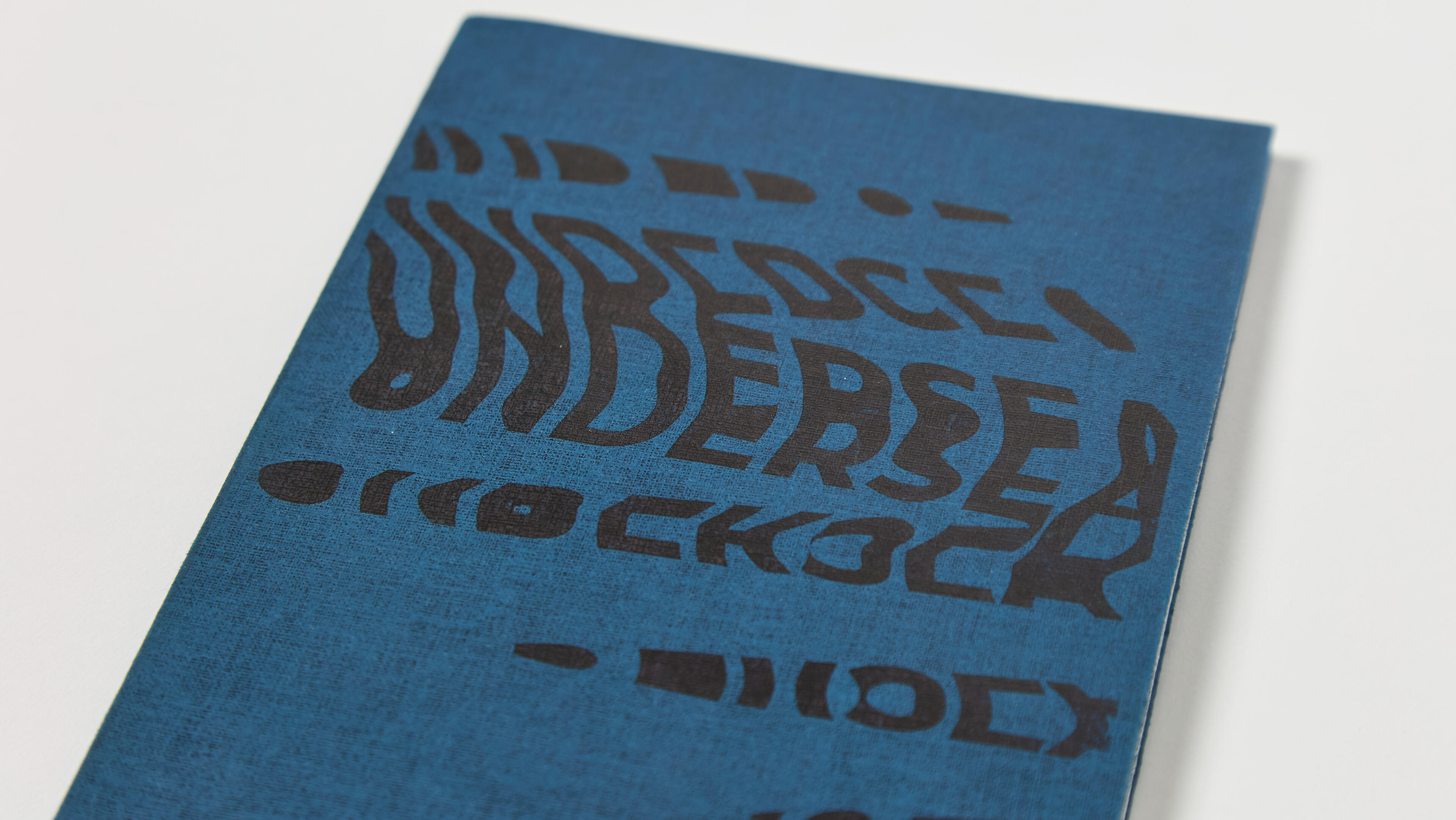
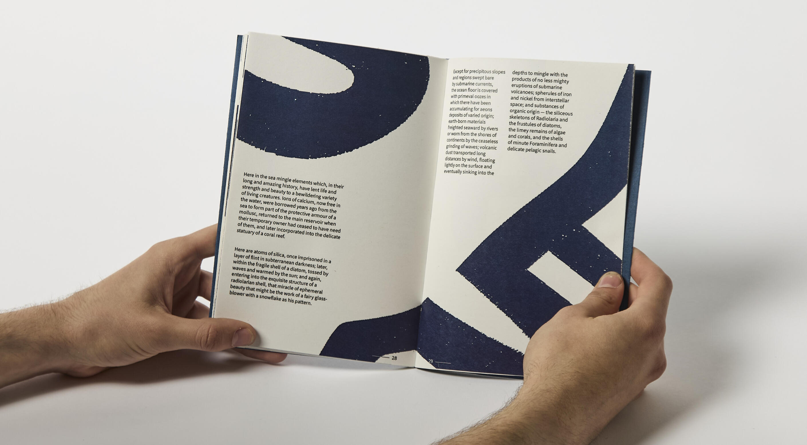
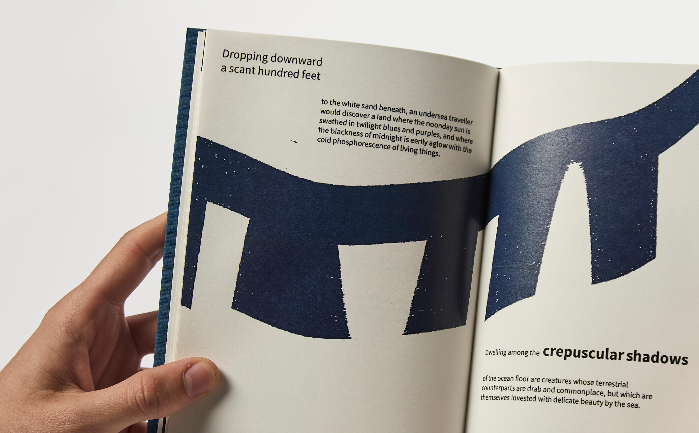
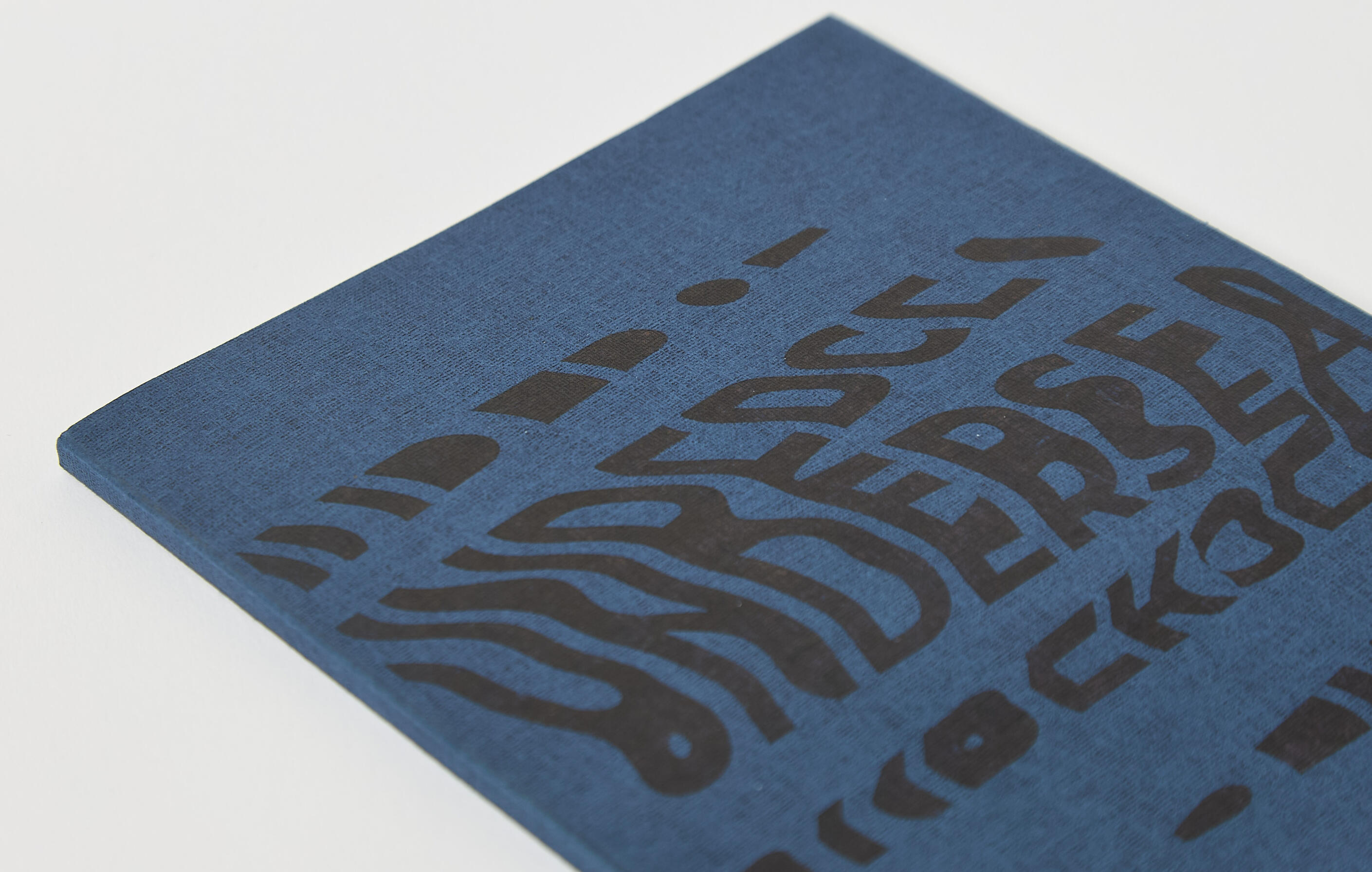
Undersea
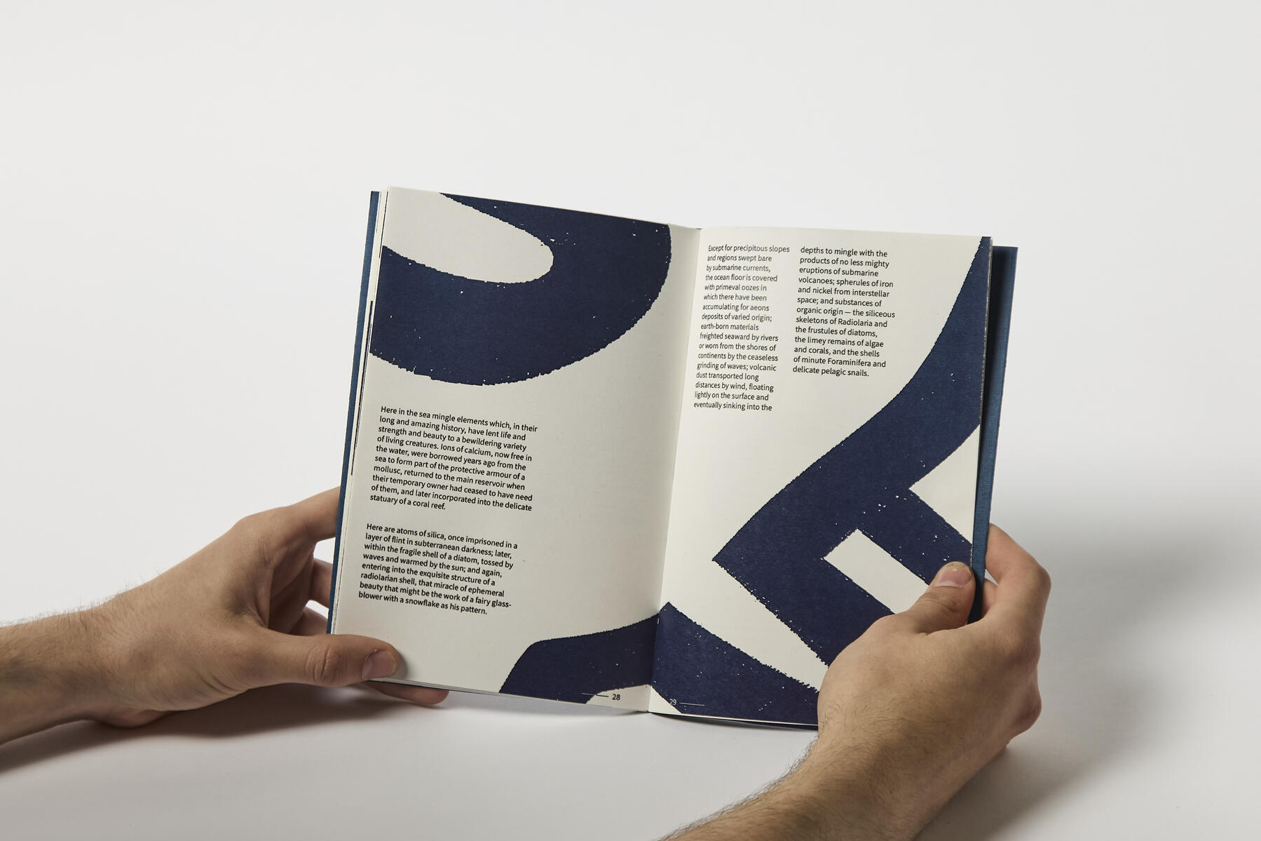
In this module during my second year of University, I was given the task to turn an essay provided on a Word document (Undersea by Rachel L. Carson) into a 32-page book. We were challenged with creating a narrative and images through typography only, which lead me to focusing on the overarching journey of the story. With this idea in mind, I broke it down into three main themes which then determined the colour, paper and typefaces. These themes were temperature, light and pressure.For the main part of my design, I used photocopy distortions to create the movement effect on the cover title and used these individual letters throughout the document. These letters would then tie the pages together and allow the narrative to be shown through the type and composition without relying on images.I learnt a lot in this module and it was my first experience with book binding, which further ignited the spark and love I have for editorial design, and allowed me to think further about the use of materials and typography which go deeper than surface level.
Behind the Scenes and the Creative Process
UX/UI Design
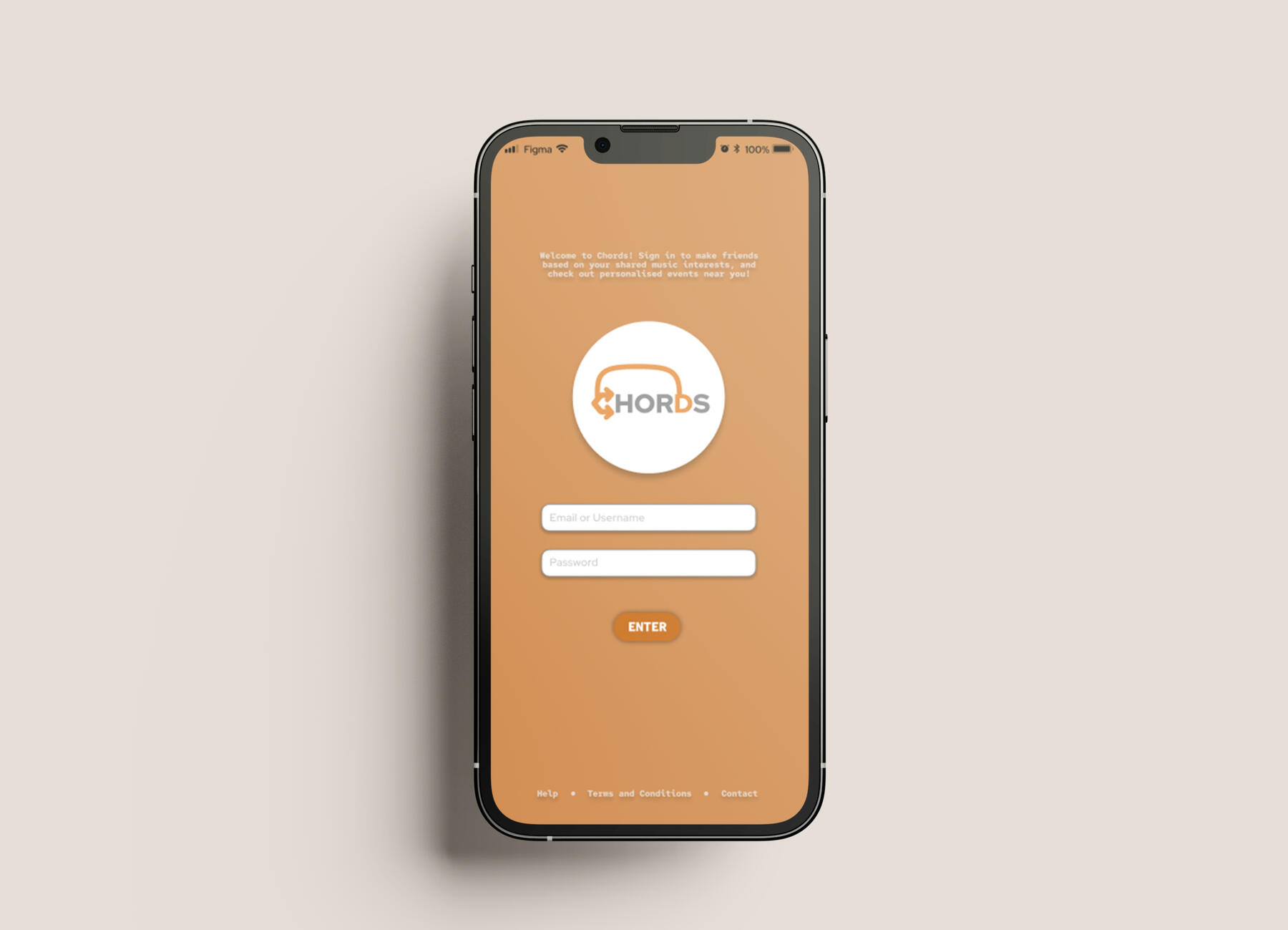
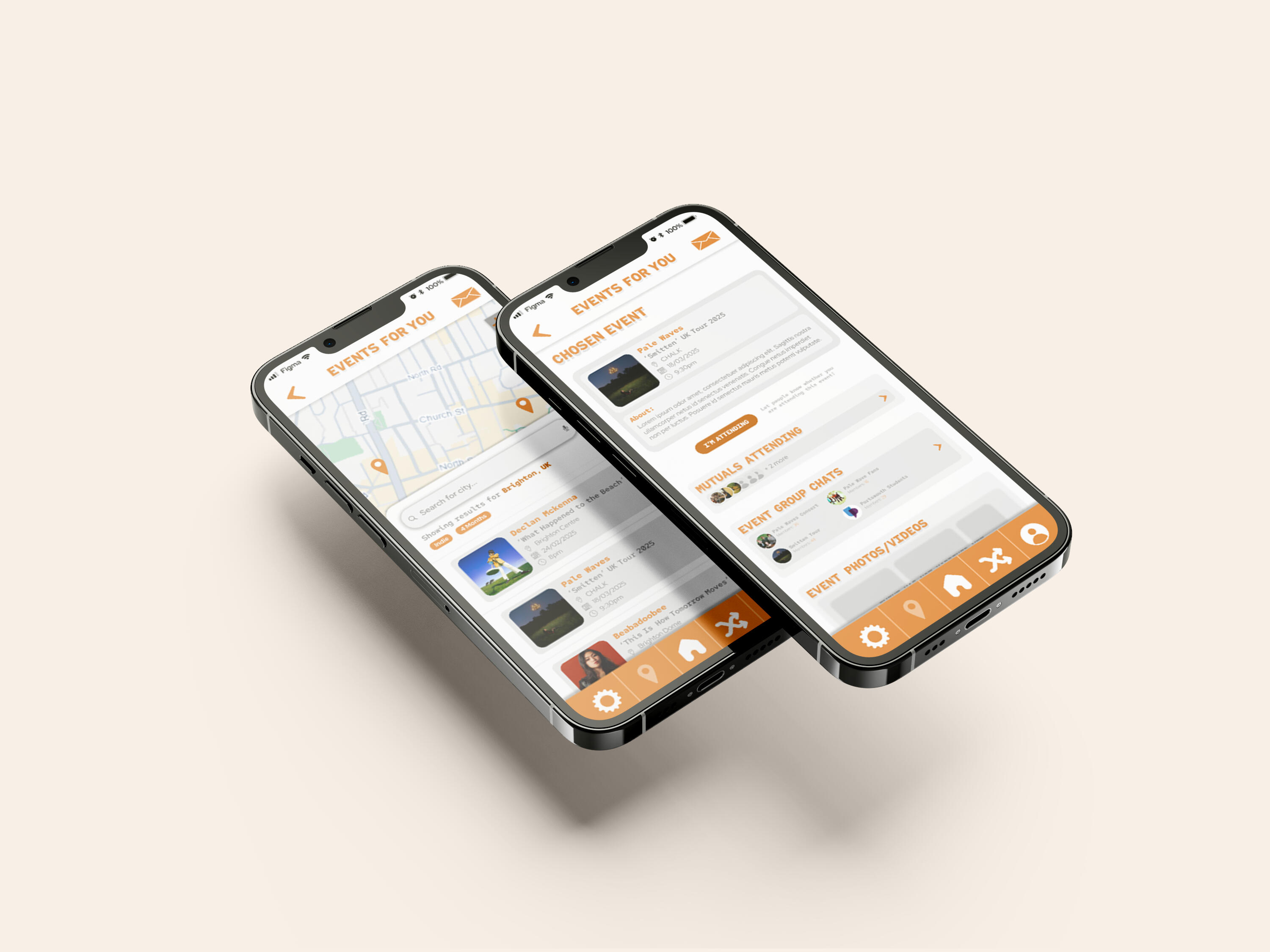
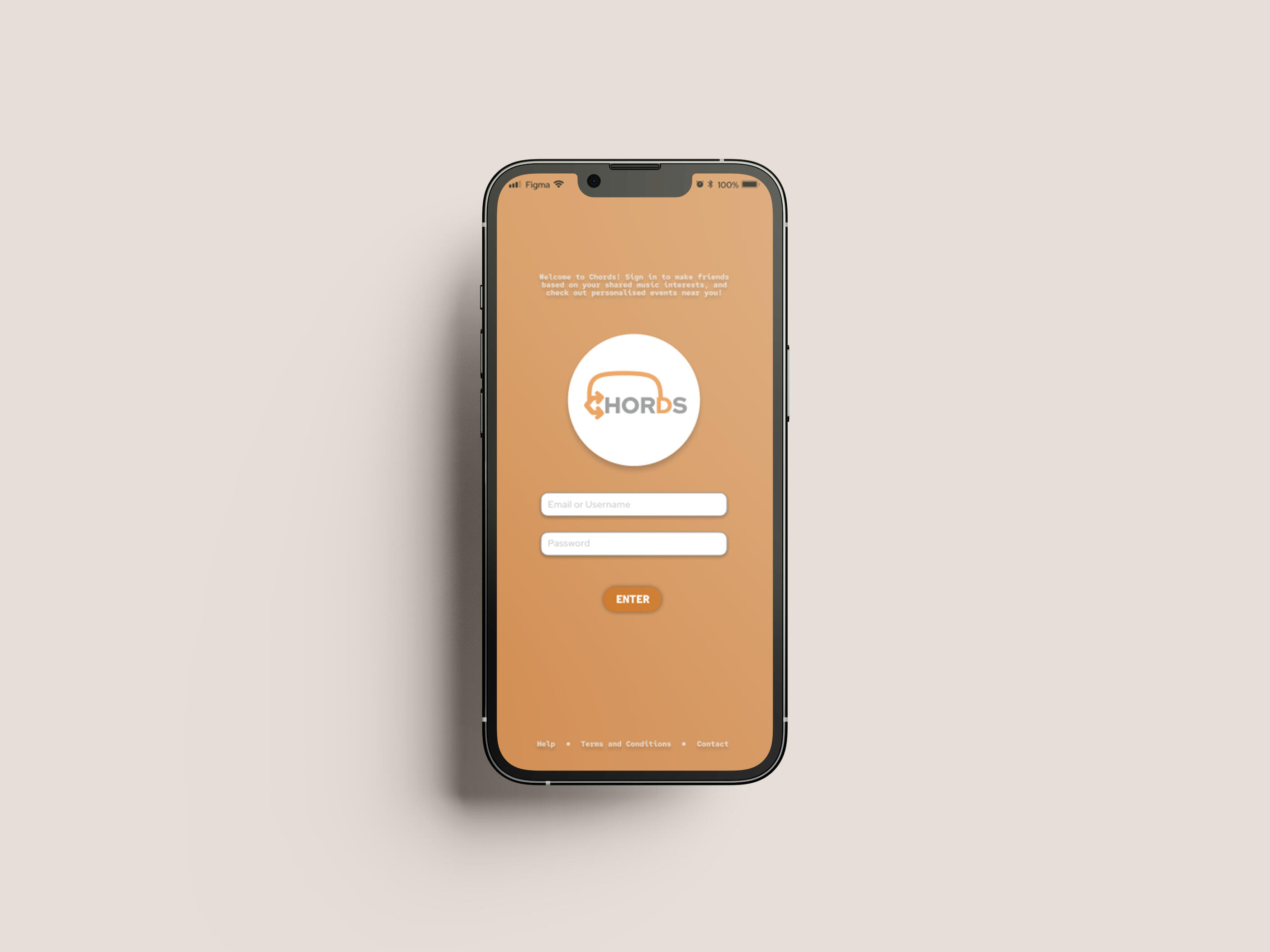
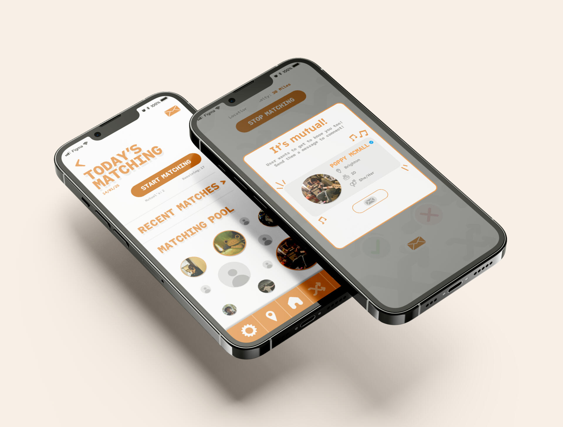
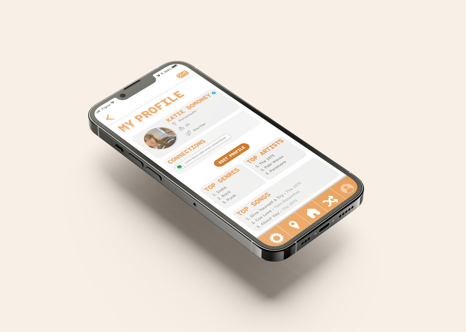
'Chords'
The aim of this project was to create an app and make it easier for University students to make friends using a common interest. This excited me as it was my first endeavour with UX/UI design. I used Figma to create the layout and prototypes, teaching myself the ins and outs of what this sort of application needed. For my app, I of course chose to base it around the common interest of music.‘Chords’ is an app where you can match with people based on music taste, talk in both groups and 1-1, and find music events near you, which also allows you to see who is going and make friends through that.I used inspiration from apps such as Spotify, Airbuds, Unifi and Hinge to influence my research and understanding of user experience and interactivity. I had experience gathering first-hand information and conducting interviews to further support my ideas and design, making sure the target audience is always put first. My findings allowed me to curate an all encompassing safe and easy space to find people with similarities, getting rid of the awkward small talk and initial anxieties when it comes to meeting new people.‘Chords’ caters towards all different people. Whether you’re an introvert, extrovert, living on campus or away from campus, there is something for everyone. Just swipe to match based on music taste, look out for events near you, and find friends who fan over your favourite artists just as much as you do.

Behind the Scenes and the Creative Process
Independent Design Practice
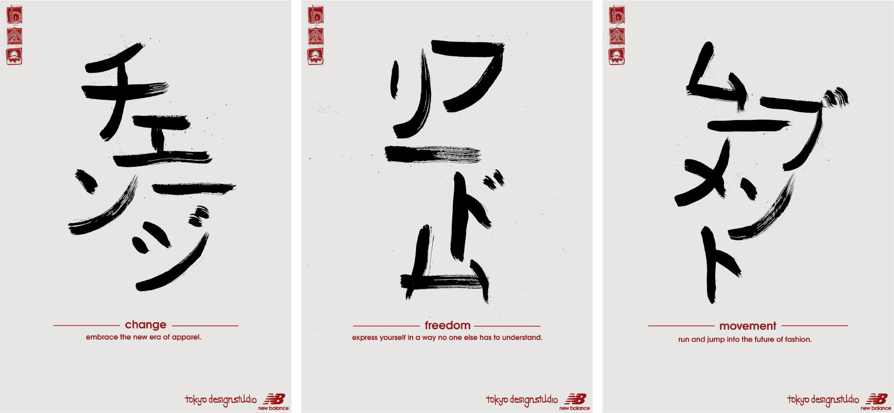
Tokyo Design Studio Rebrand
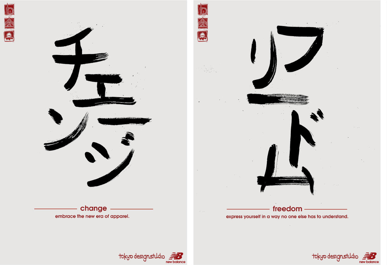
For this project, I came up with and designed a new brand identity for Tokyo Design Studio, and to create examples of touchpoints which you would find these designs in.Tokyo Design Studio (TDS) is the dynamic brand for New Balance and focuses more on experimental styles and techniques, rather than typical advertisement. This was the main idea I ran with throughout my project, aiming to communicate this within the branding.I wanted the TDS brand identity to demonstrate the idea of embracing change and a new future, while also holding onto the tradition that acts as a foundation for the whole of TDS keeping that connection to its parent brand – New Balance. Therefore, my designs were heavily inspired by traditional Japanese techniques such as calligraphy and printing, using methods like lino printing, Japanese writing techniques, and videography. It allowed me to think more about concepts, bringing my ideas to a different level.
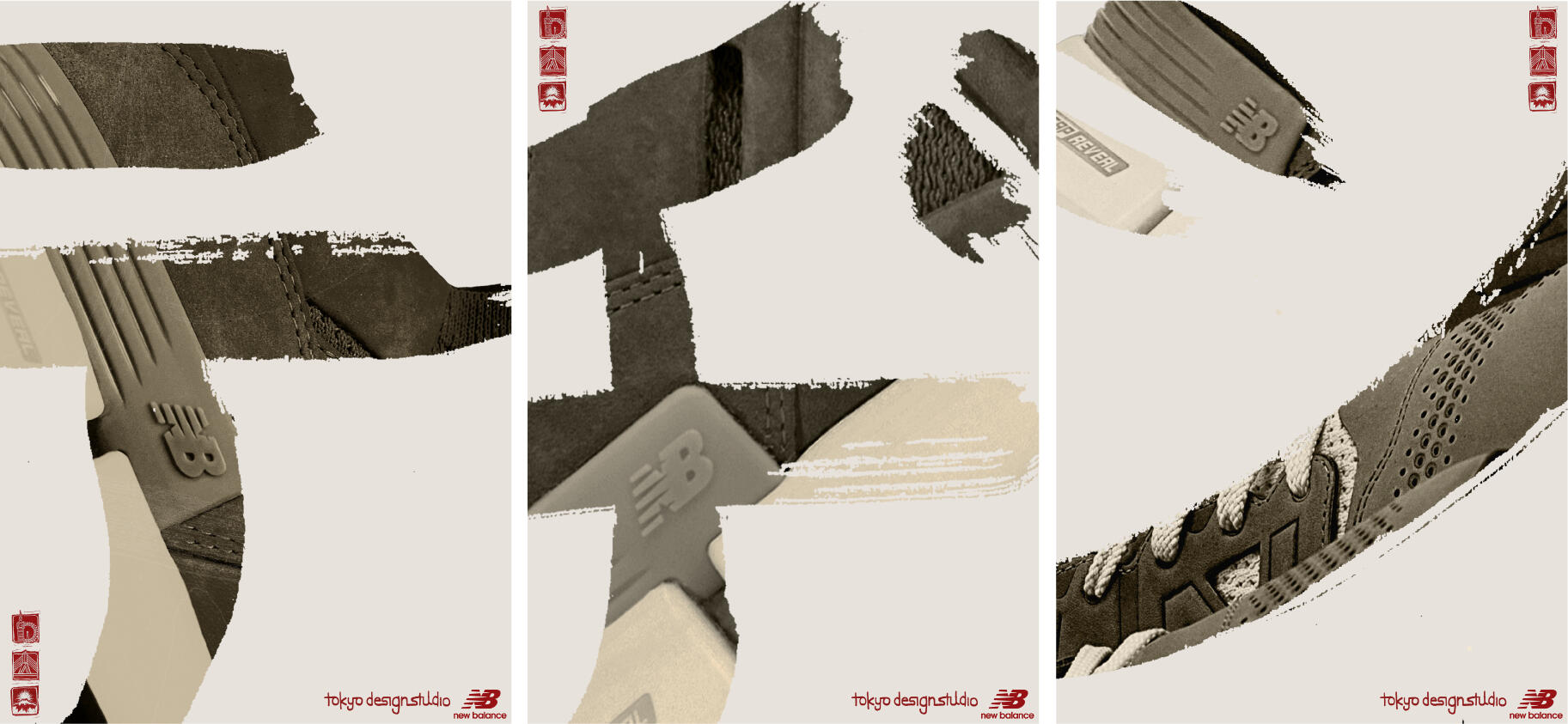
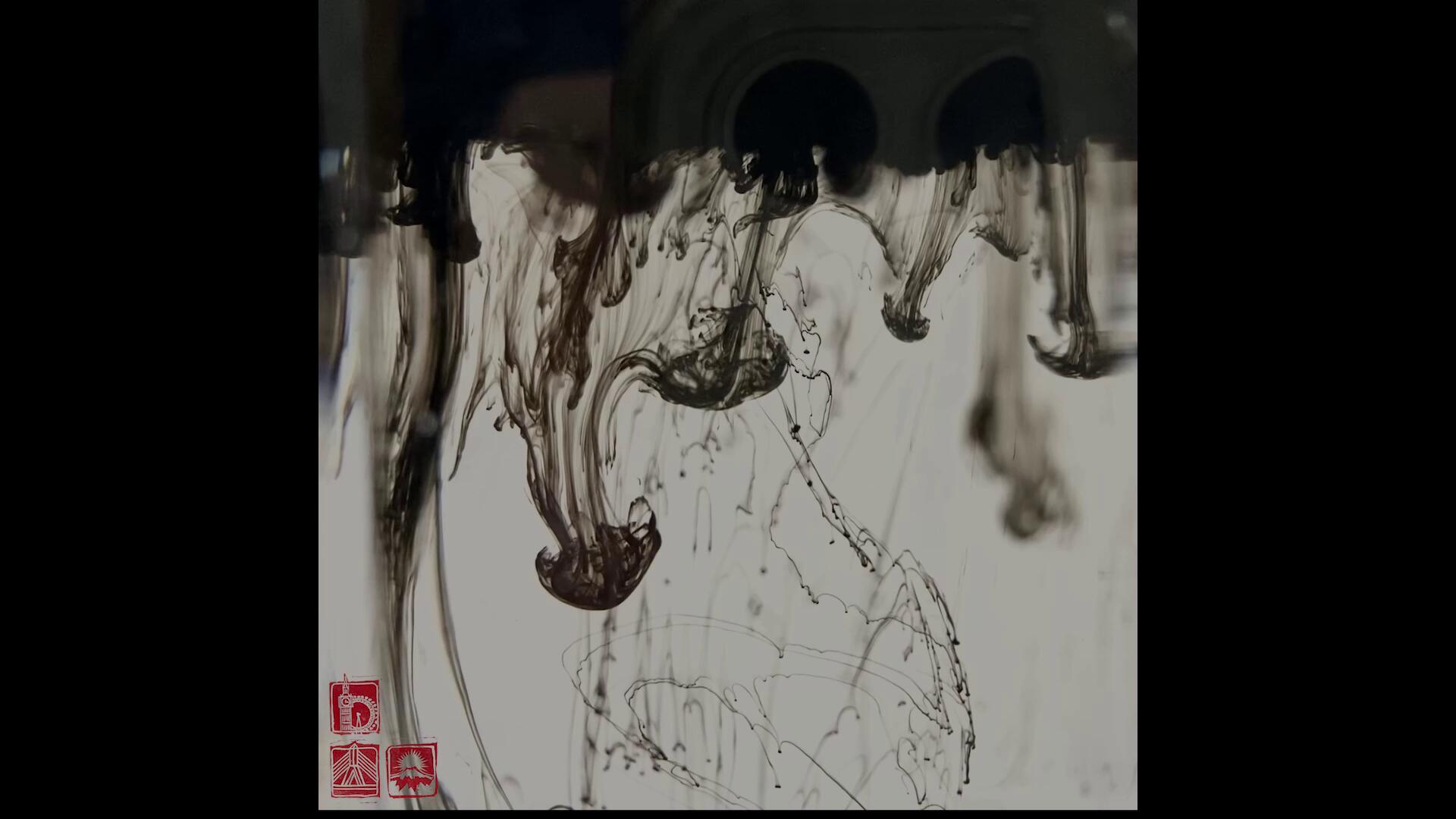
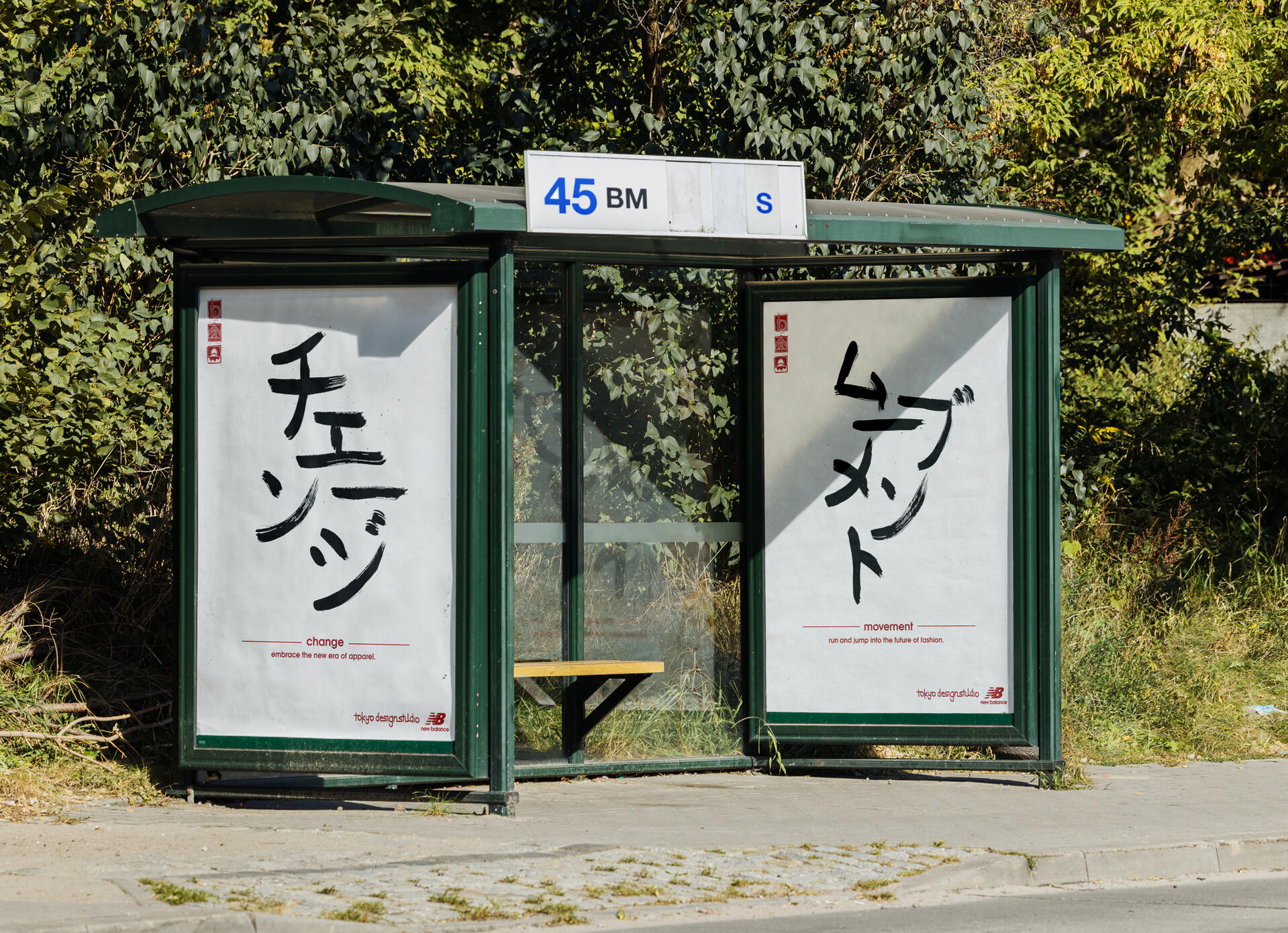
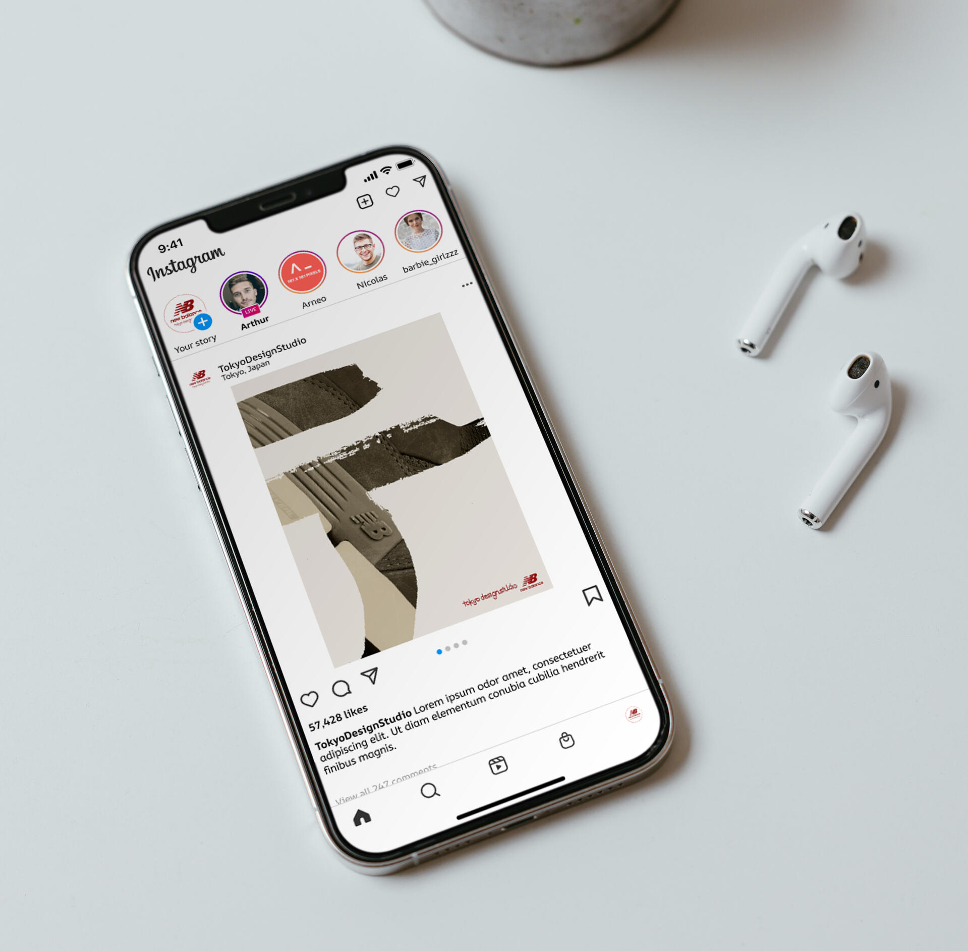
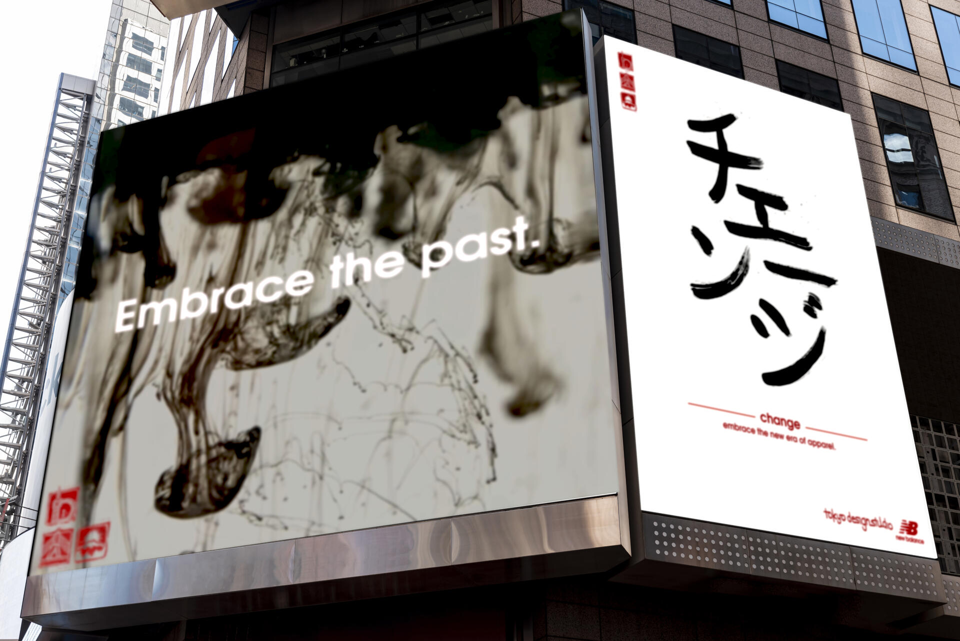
Behind the Scenes and the Creative Process
Ethical Design
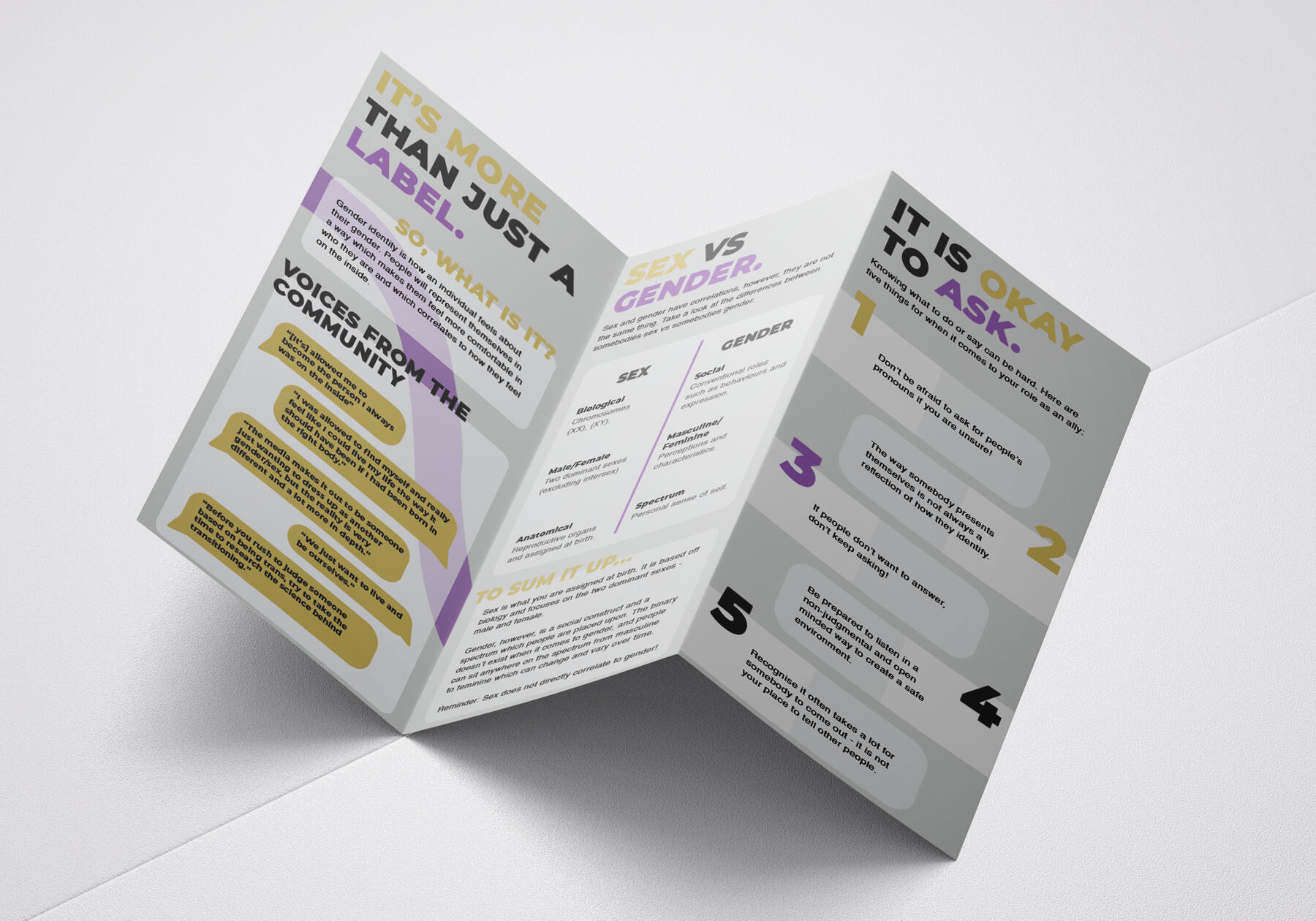
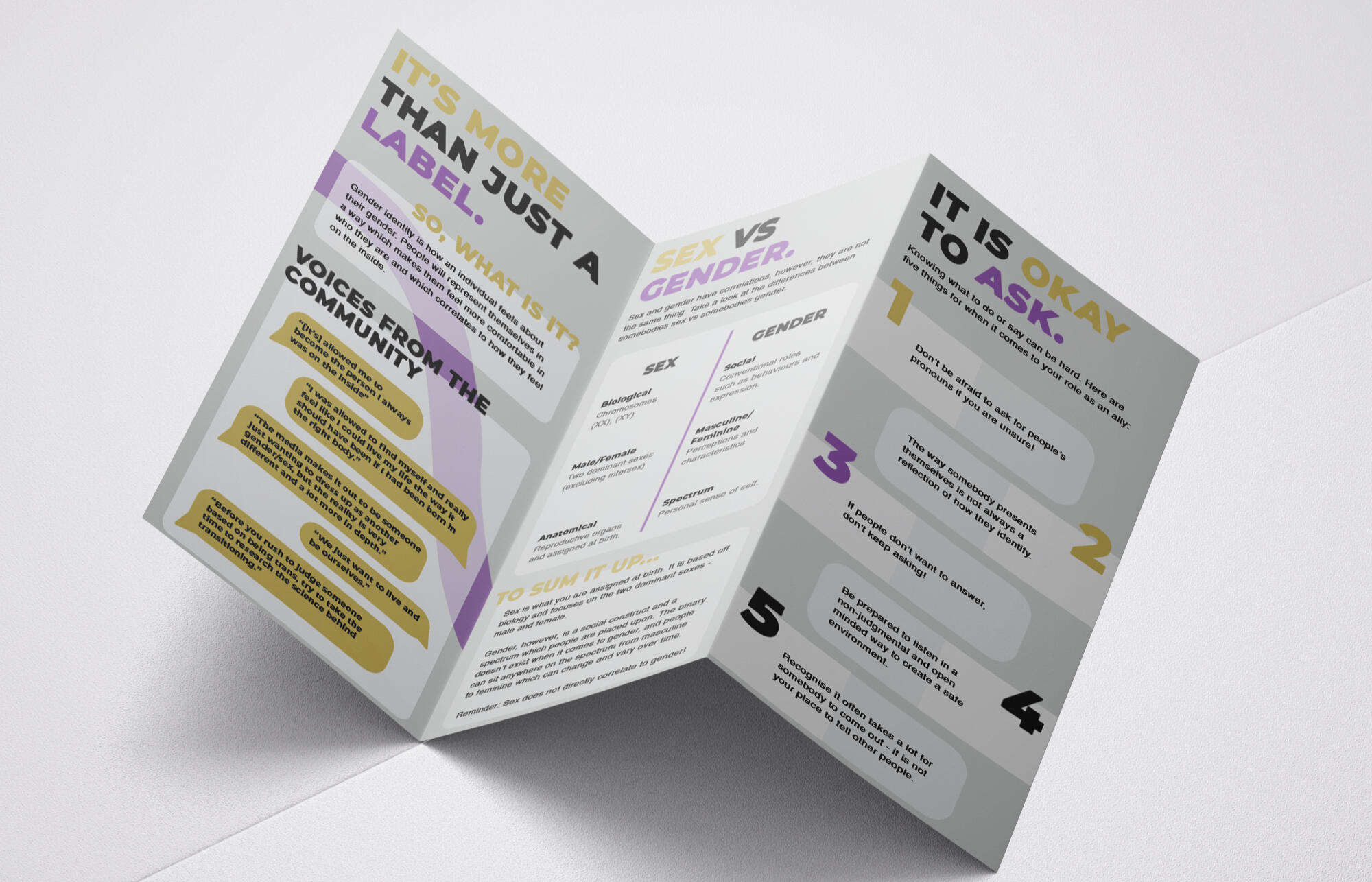
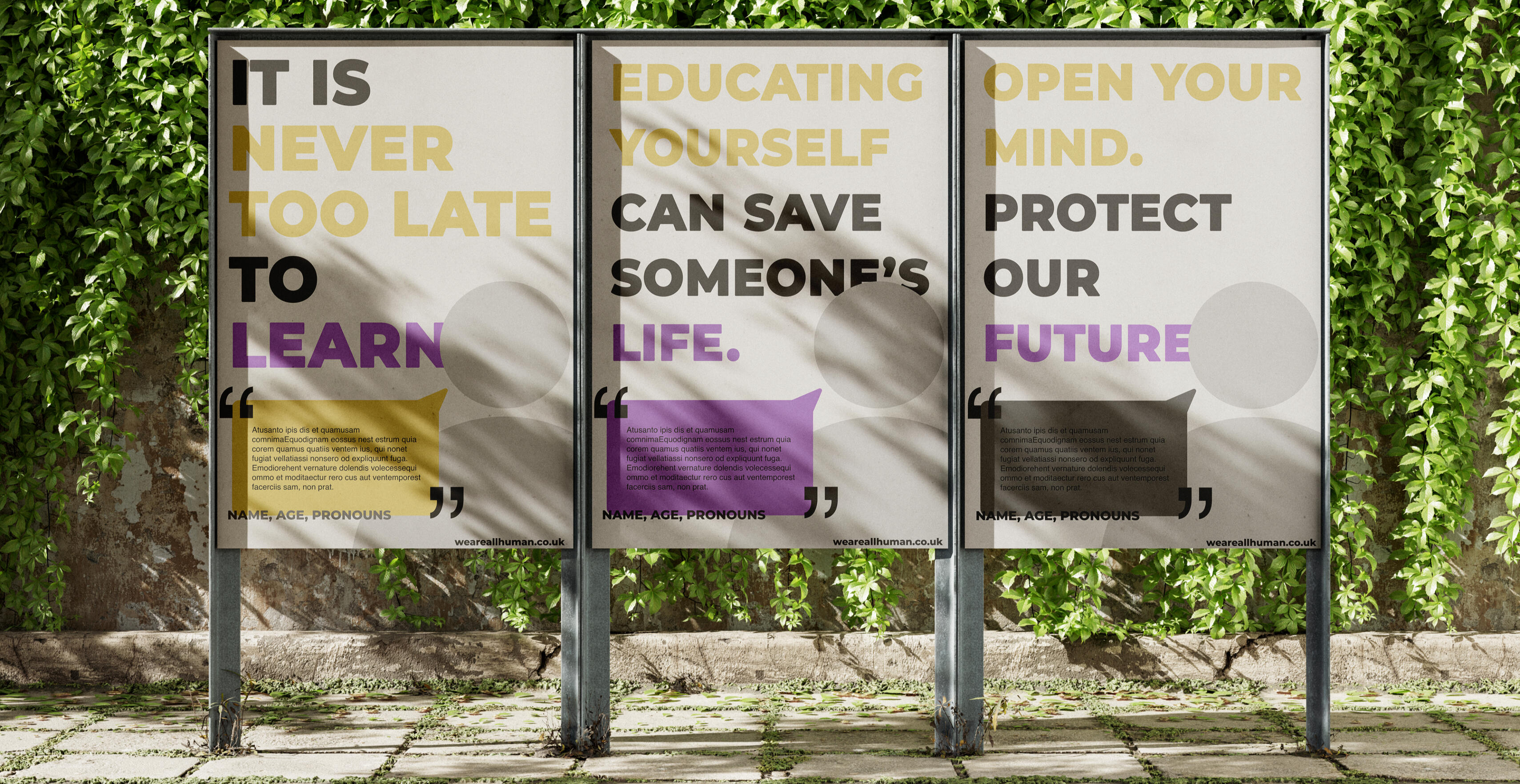
It is Never too Late to Learn
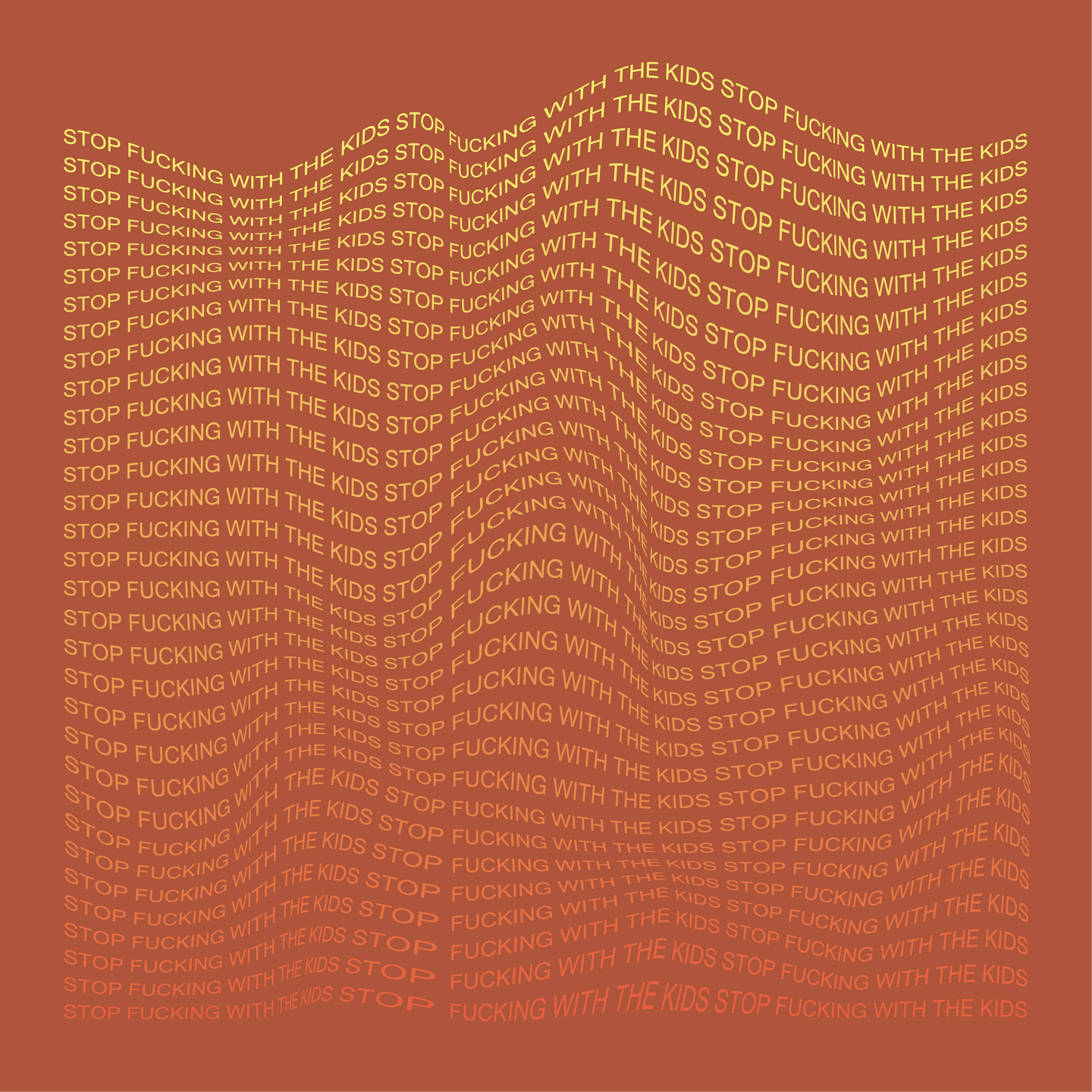
I designed this campaign with the intention of educating the older trans allies (40-60 years), giving them a tool to learn about the trans experience. This campaign started due to a conversation with my parents where it was said that “if I understood more, I would be able to empathise better.” This led me to think of the best way to educate parents/guardians of trans individuals in a simplistic and non overwhelming way.After multiple tries, I ended up taking a stance which involved creating things the younger generations (15-30) who identify as trans could come across to give to their parent/guardian. This would then allow trans kids to feel seen and understood by their loved ones. Using responses from a questionnaire, I was able to narrow down key issues I was going to cover in my products.I communicated my message with typography and colour scheme, carrying the same style throughout. The colours represent the non binary flag, helping to show the topic I'm covering.
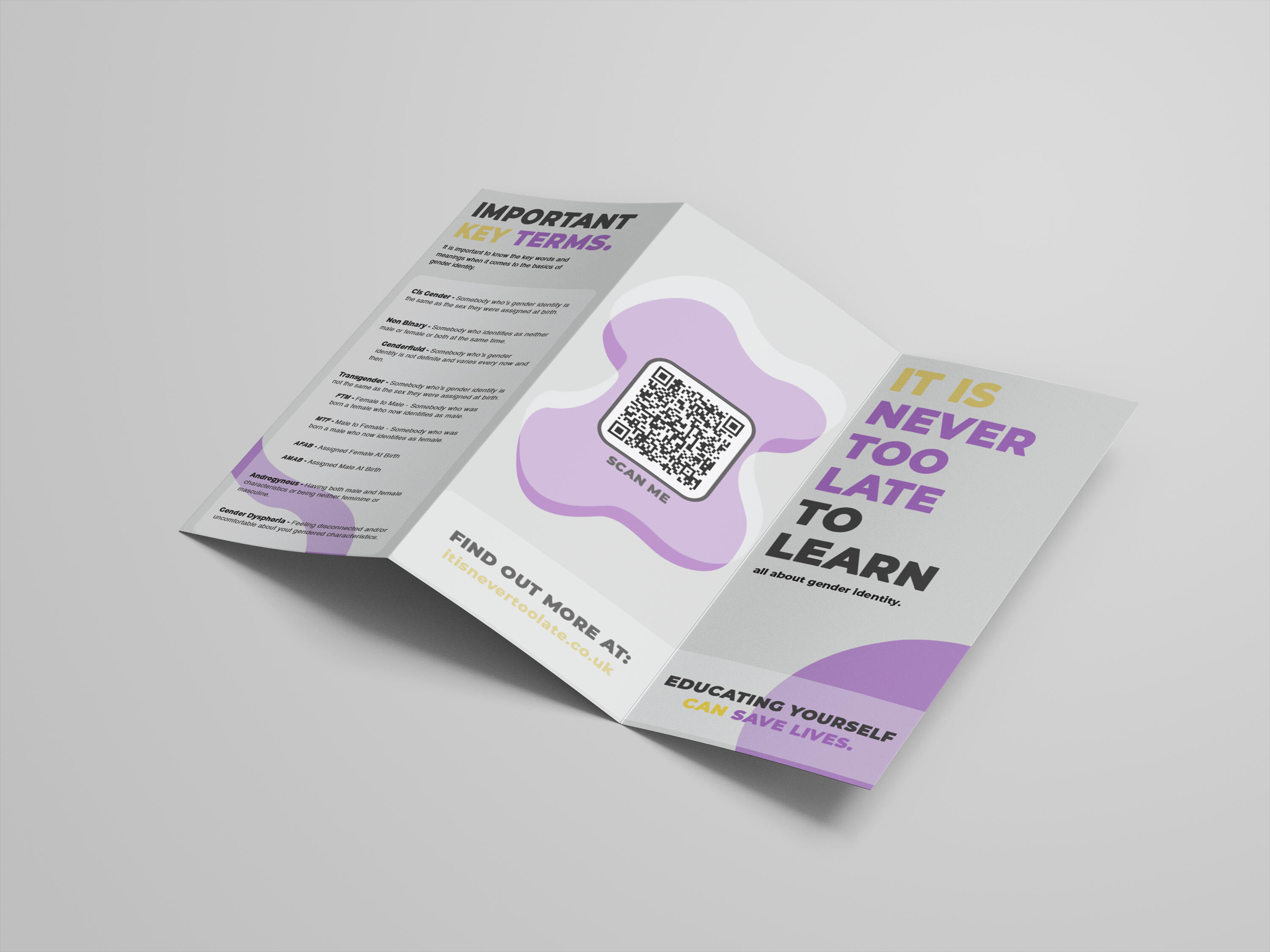
I started with the leaflet which would be handed out in secondary schools for kids to take home to their parents. This would allow the information and education to start early in potential trans kids’ lives. I then moved onto creating a website which including things the leaflet did not.For example, links which provided the next steps for the audience to take after gaining an understanding. I realised that social media would also be a good way to promote a digital version of the leaflet which could be sent to loved ones, targeting the part of the younger generation who don’t attend secondary school, and therefore wouldn’t have the leaflet physically.My campaign educates the chosen target audience in the right tone, allowing them to not only support their trans children, but also support the trans community as a whole.
Behind the Scenes and the Creative Process
Research Informed Design
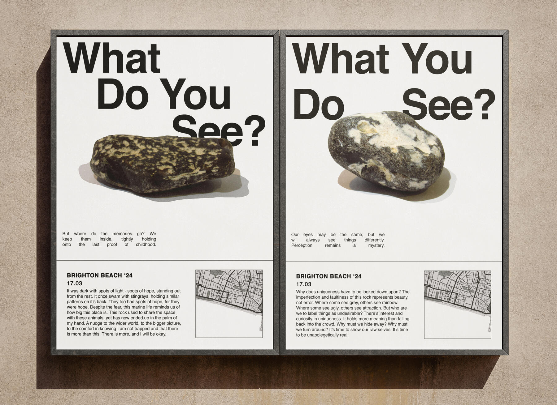
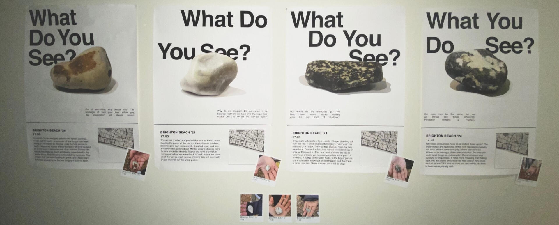
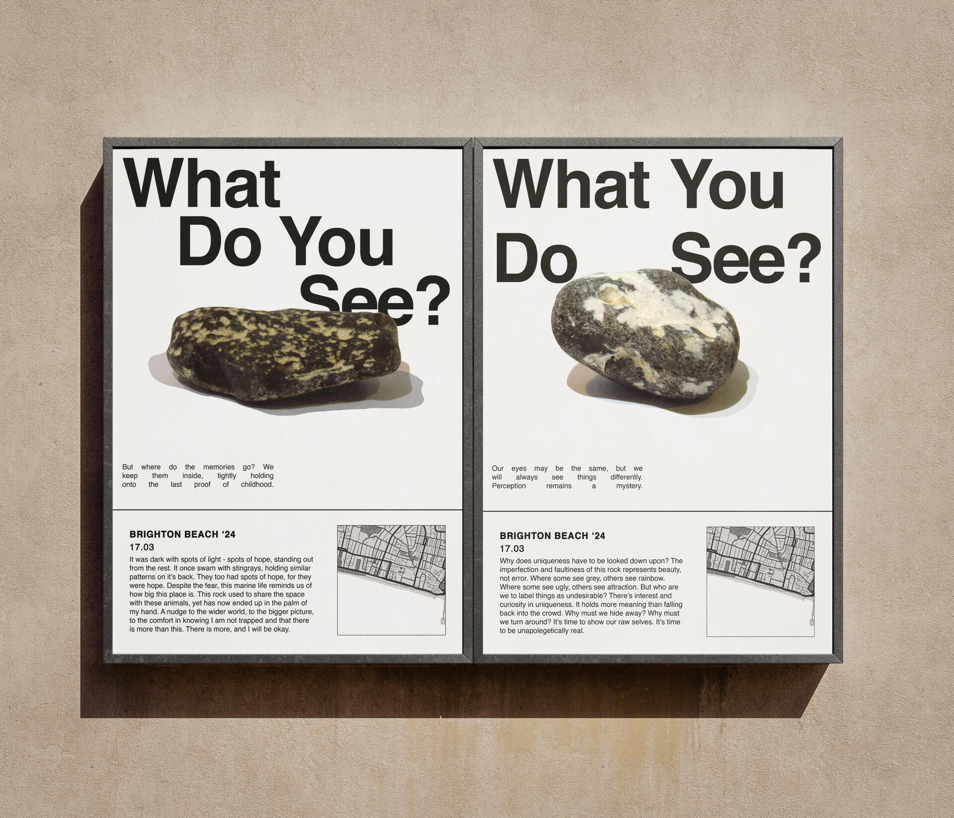
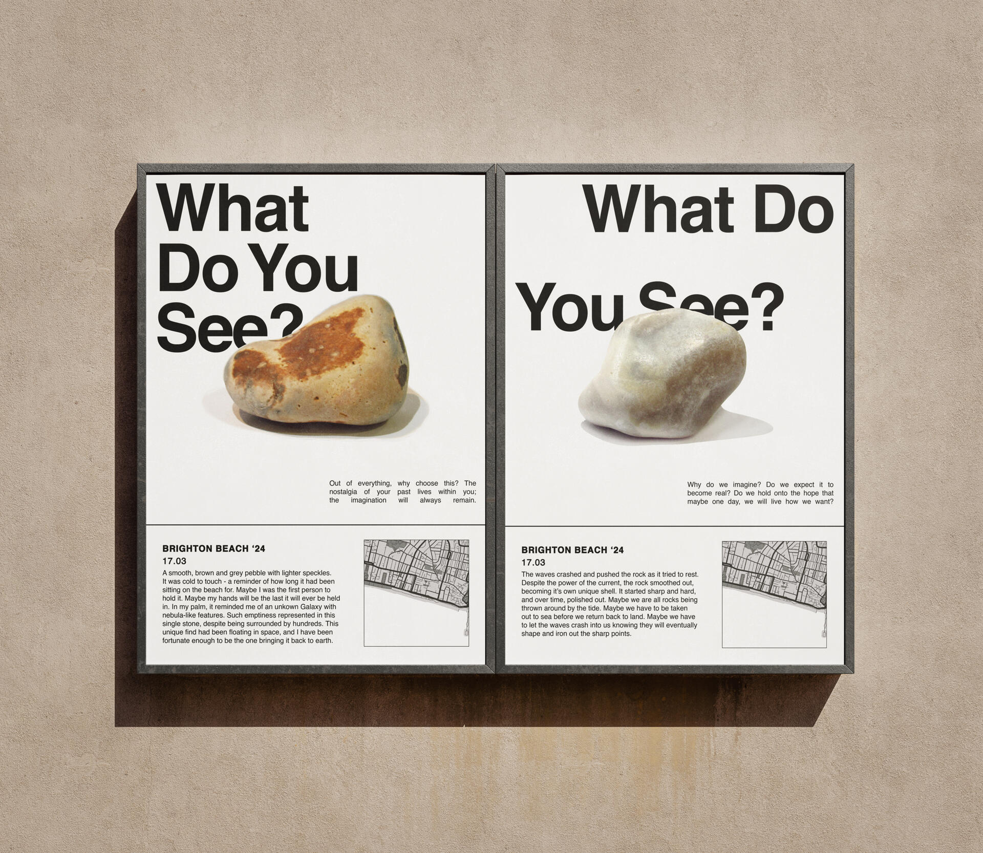
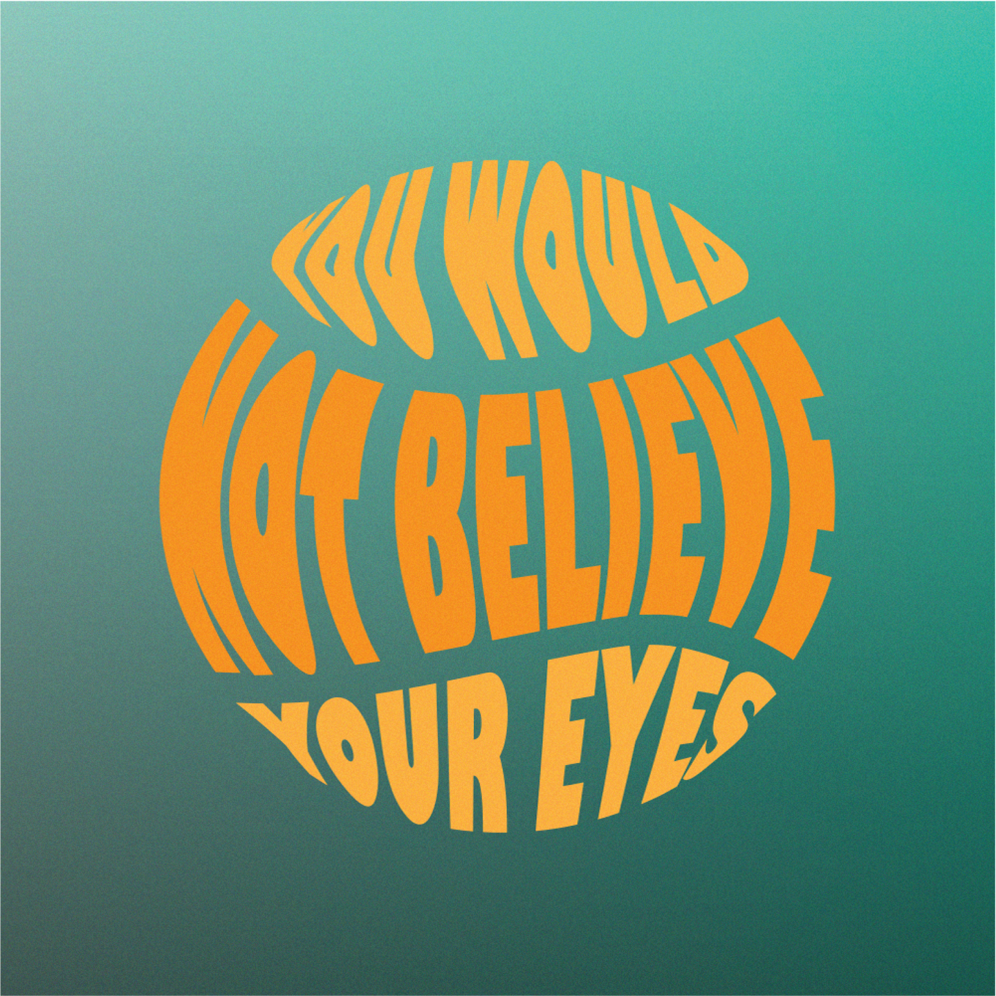
'What Do You See?'
The uniqueness of people’s interests and things they deem to be special really interested me and throughout this project, I wanted to represent the idea of finding the 'one' thing that stands out to you and the emotions that come with it. I find there to be a lot of beauty in what people choose to be important, and how everyone has their own reasons and emotions and ideas about the things around them.I decided to show this idea through the concept of people finding the ‘perfect’ rock at the beach, as I had first-hand experience with this in childhood. I developed a series of posters showing how different people perceive the same things, including personal touches like Polaroids and primary-sourced quotes.This project was a huge step in what being a designer meant to me, showing the design process from start to finish. I went through the motions of finding out what worked and what didn’t and had a lot of practice with narrowing down ideas, allowing myself to get lost in primary and secondary research. I found that concepts and themes meant a lot to me as a designer, and the effort that goes into uncovering the core theme within a design.
Behind the Scenes and the Creative Process
Motion Graphics
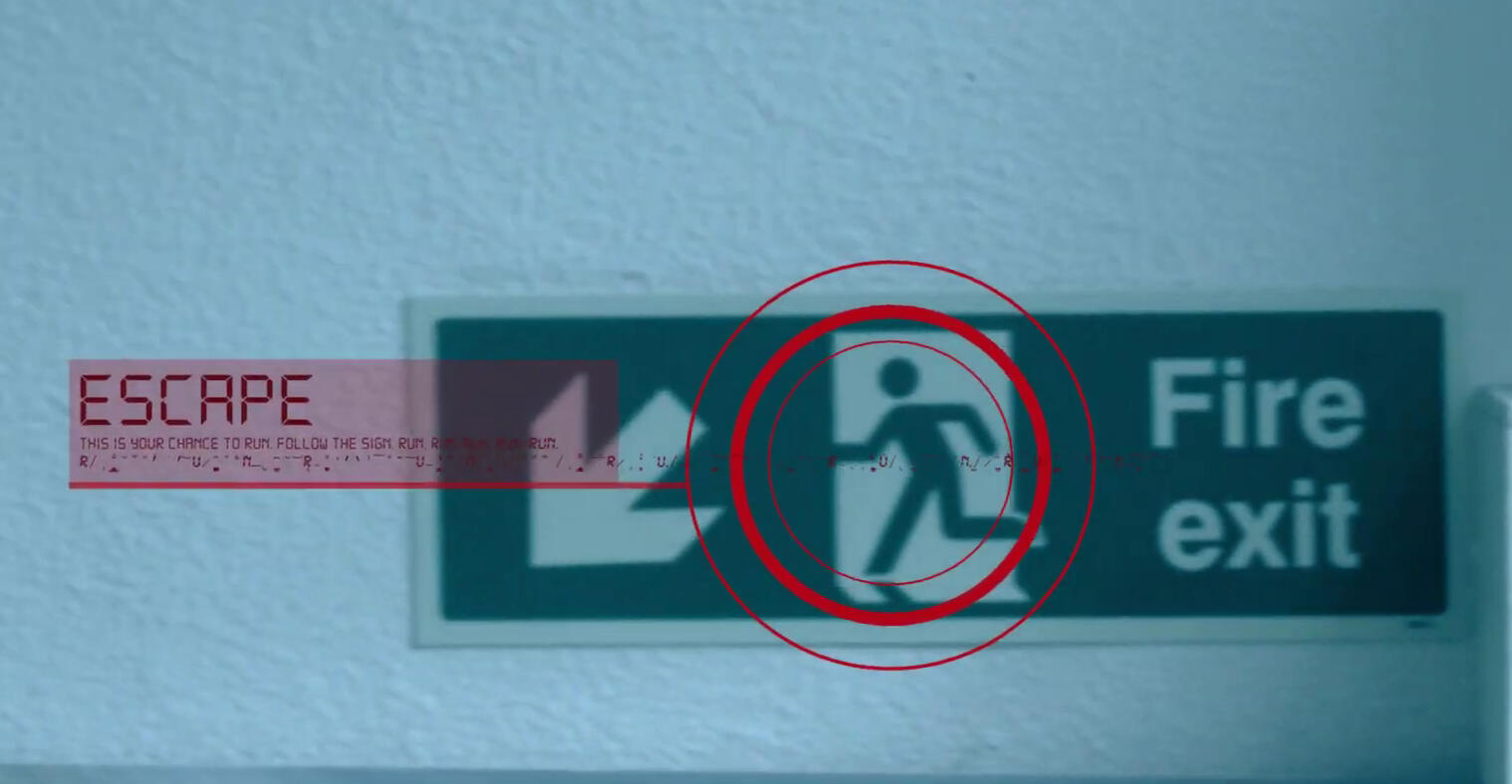
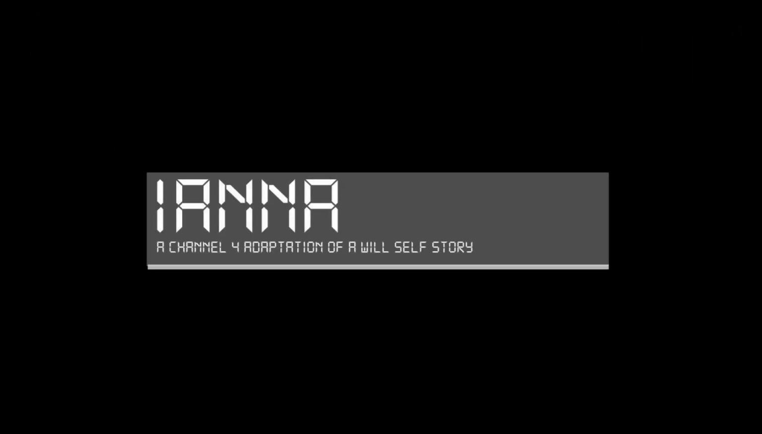
iAnna Title Sequence
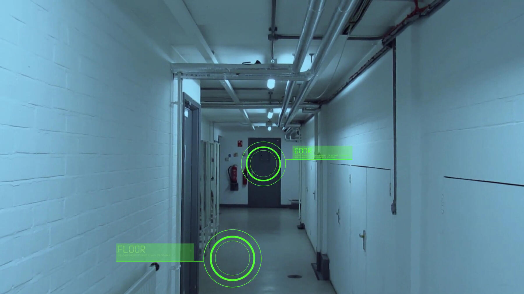
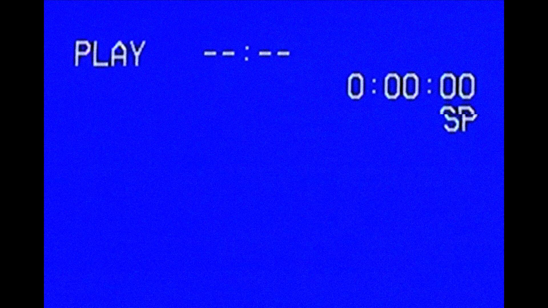
This was a title sequence I created based off a given
text using Adobe After Effects. My aim was to focus
on the main theme of this story (schizophrenia), and
the main genre (psychological thriller). I displayed this
through the footage captured, the filter put on top of said footage, kinetic type and the transitions created in post.For the captions, I wanted to use the kinetic type
to portray Anna getting more and more mentally
unstable, going from simply learning about things
to having extreme delusions and intrusive thoughts.Audio used:
Ever now - Gesaffelstein
Behind the Scenes and the Creative Process
Simulated Freelancing
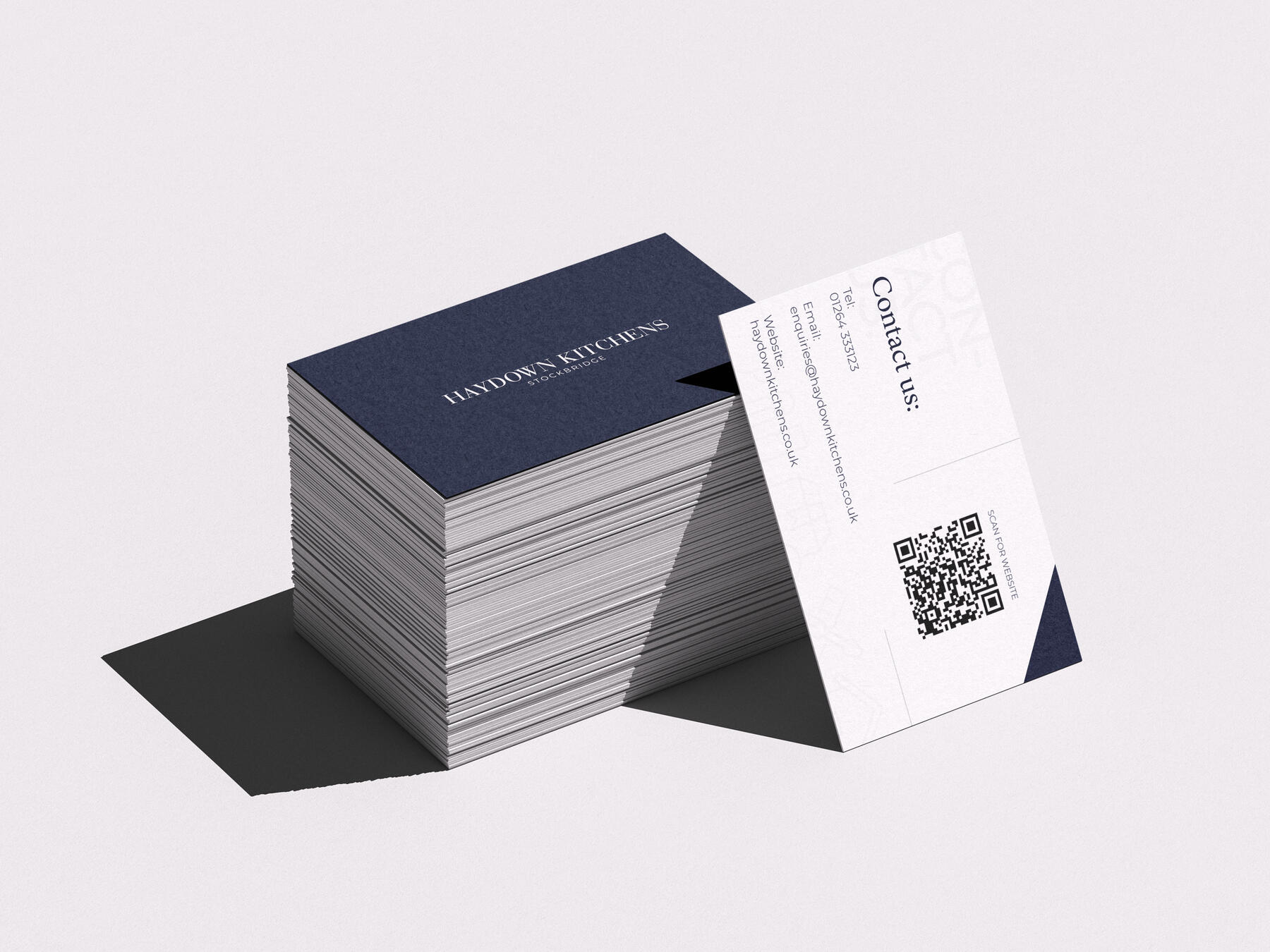
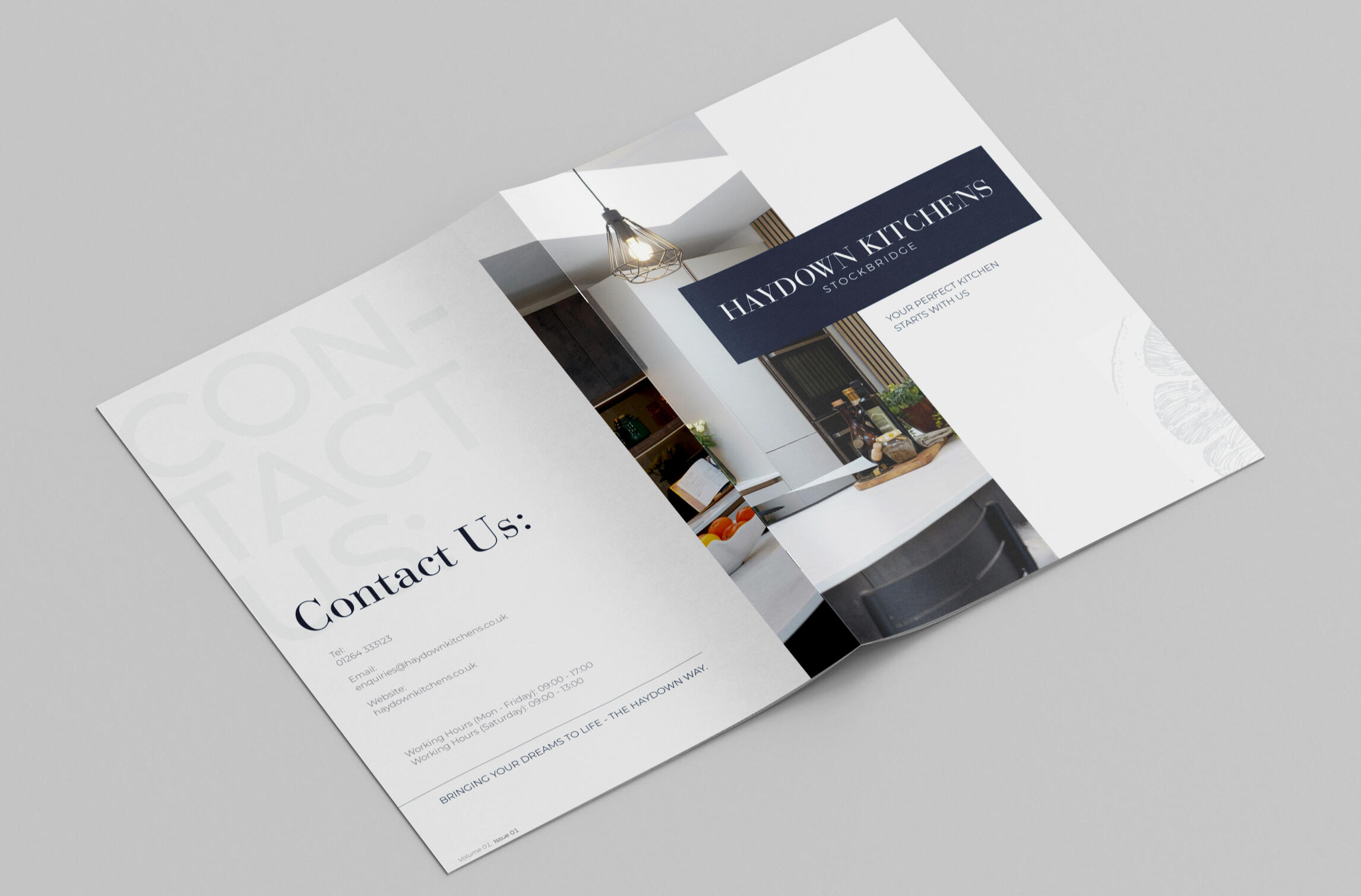
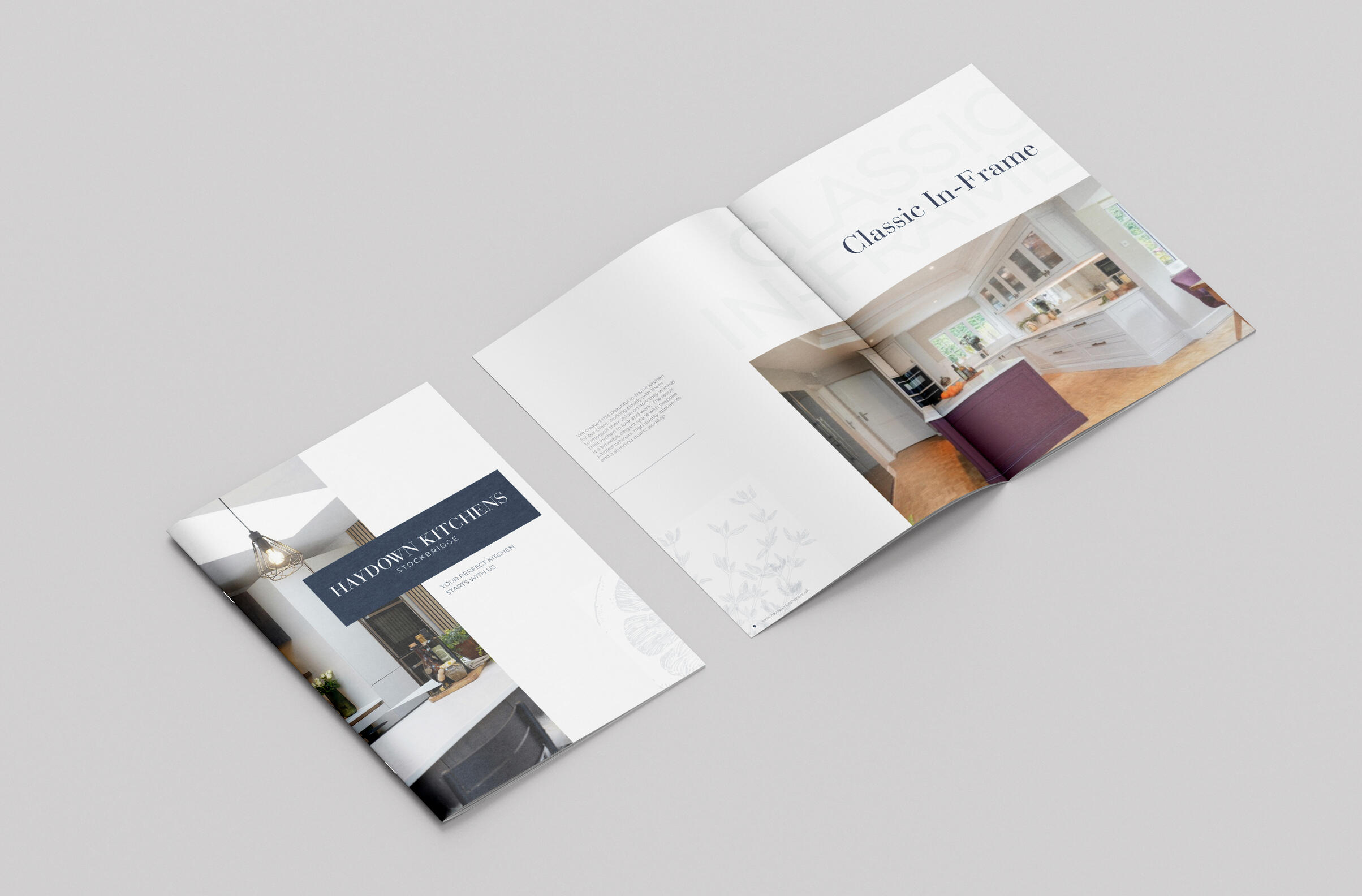
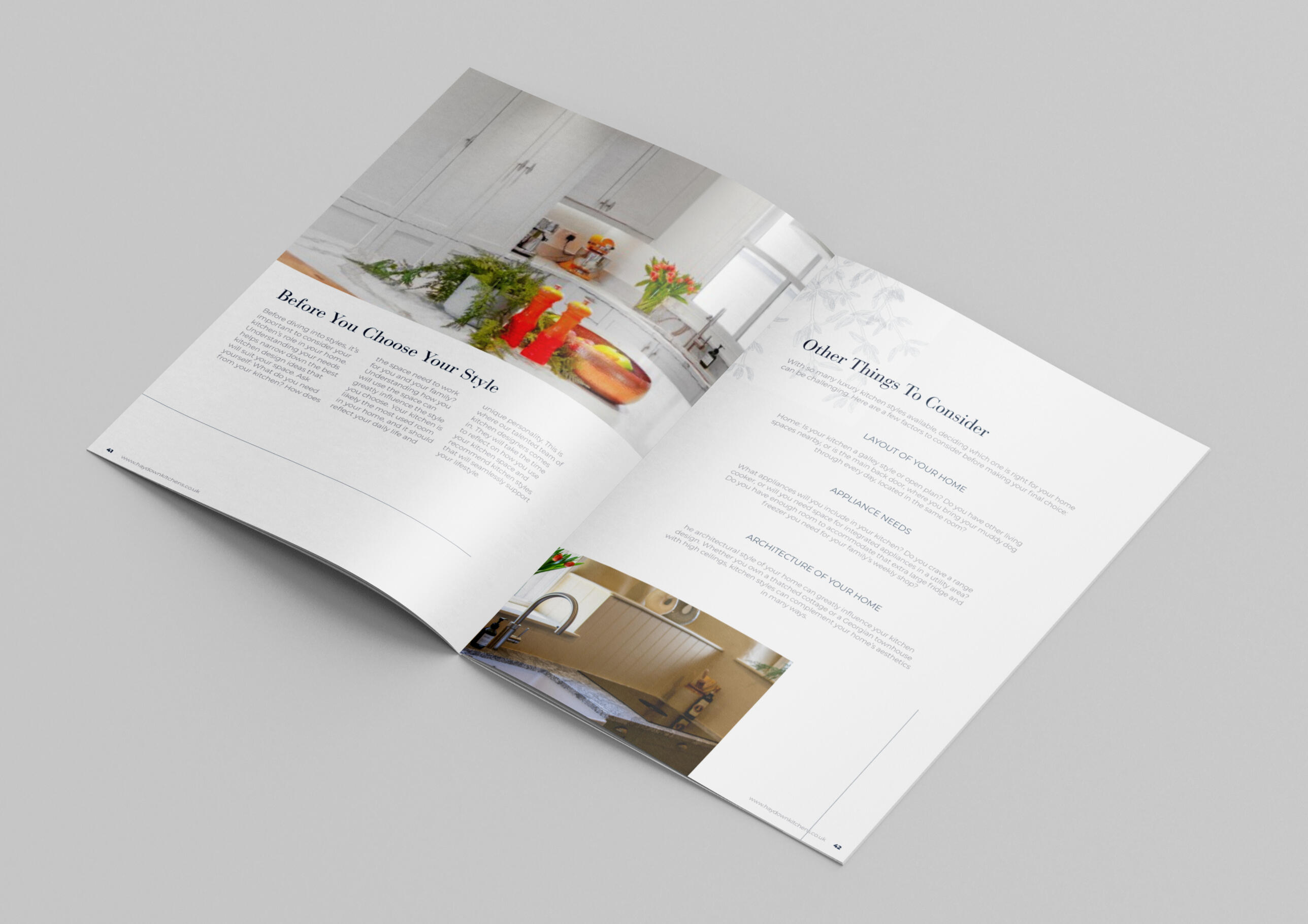
High End Kitchen Brochure
In this University module, I had the opportunity to experience what freelancing would be like. I was able to reach out and follow a past live brief, allowing me to use my passion for editorial design and mock-up a high-end kitchen brochure. I started with researching the brand principles and guidelines, exploring how I could make them stand out amongst competitors. I wanted my design to be innovative and uphold a sense of professionalism.I used my communication skills to conduct online meetings with a client, and work with them to outline the deliverables in my own brief & estimate. I had practice of creating my own terms & conditions, and figuring out how this type of business would work for me.This module gave me a lot of skills which I believe are vital for the future of my career. I have gained a huge understanding of the design world and my confidence has improved greatly.Obviously, I know there is still a lot for me to delve into and learn, but I am ready to face it with an open mind and a more confident stance than I was able to previously!
Behind the Scenes and the Creative Process
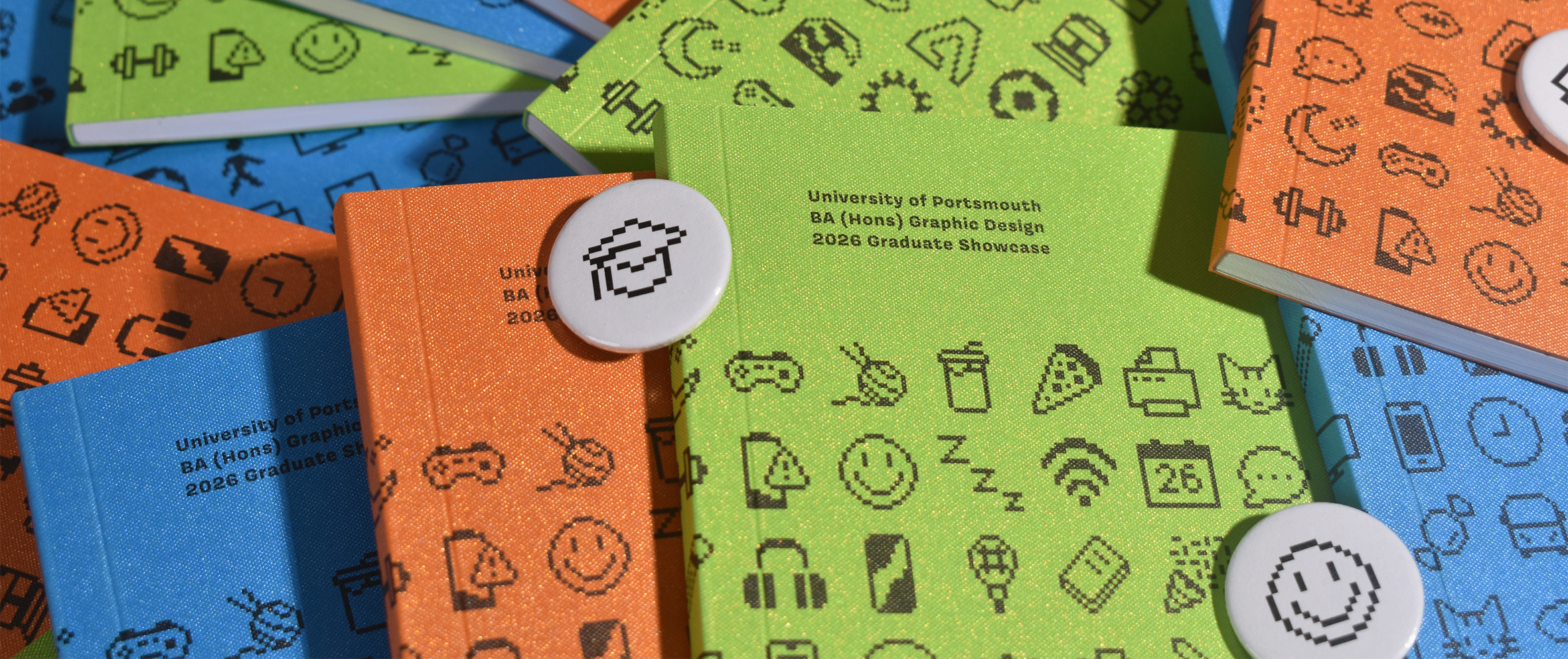
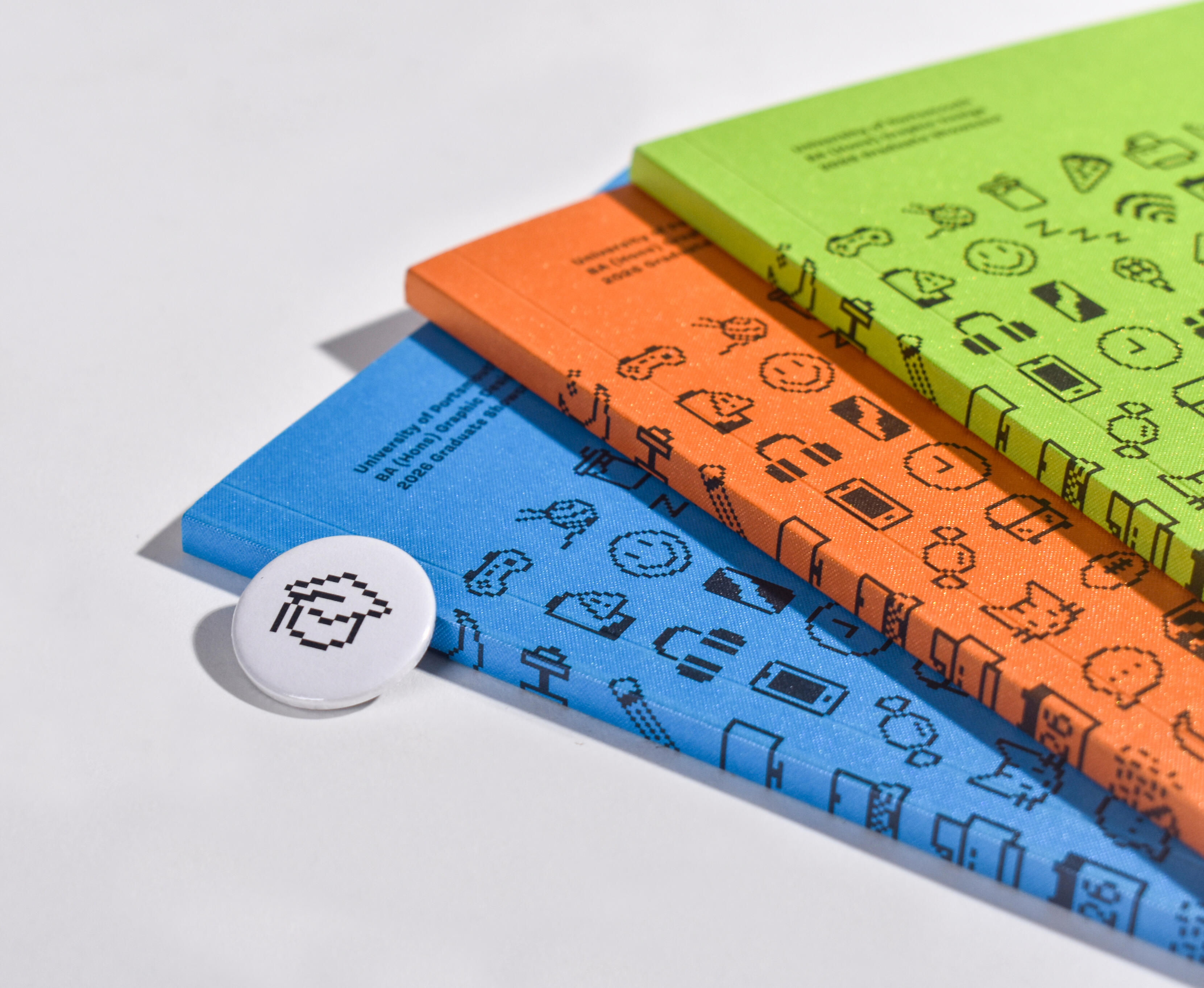
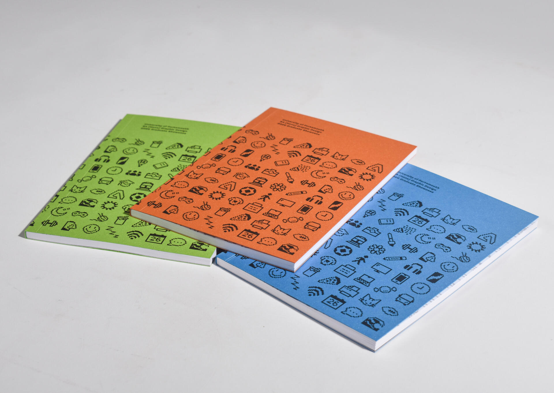
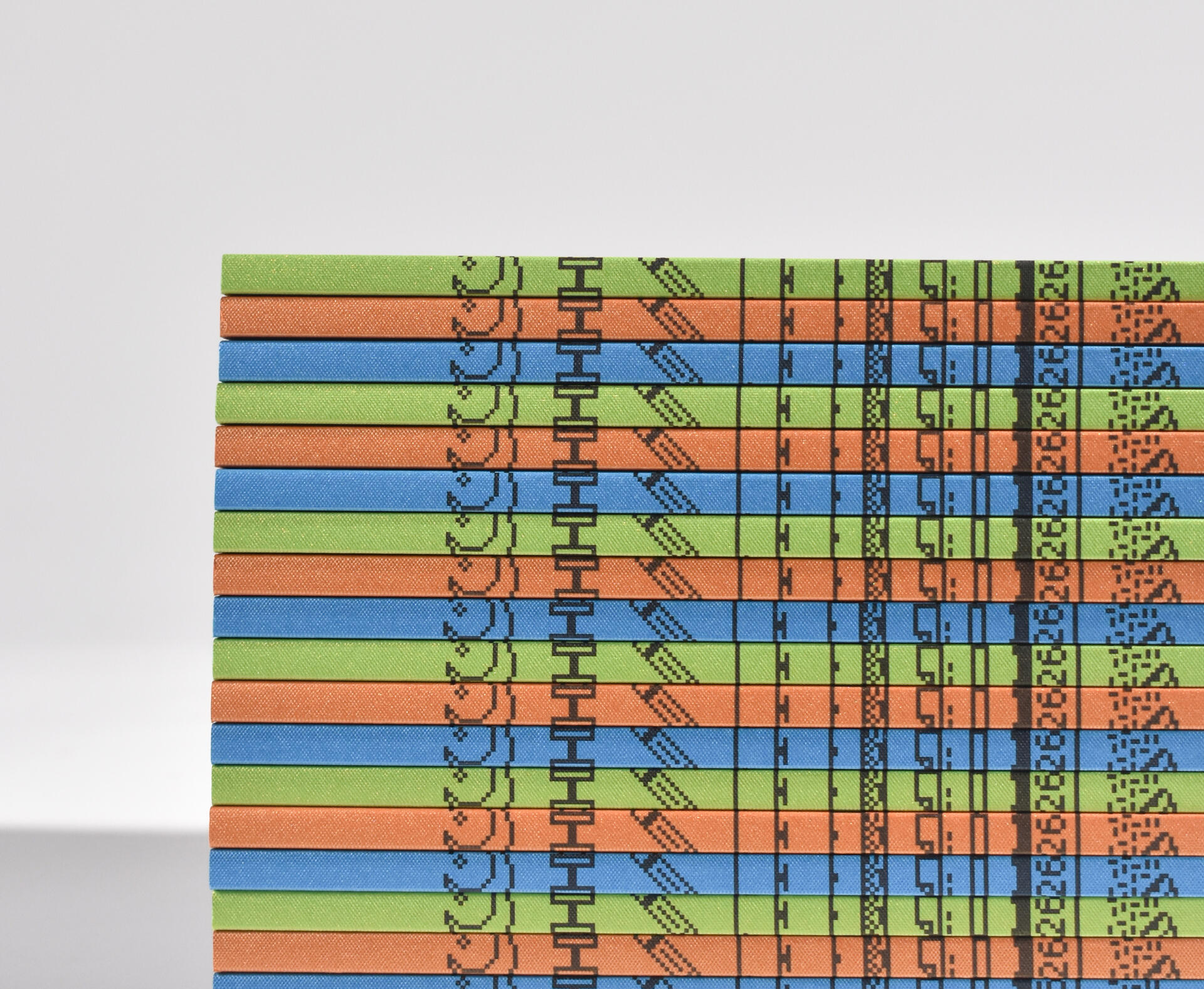
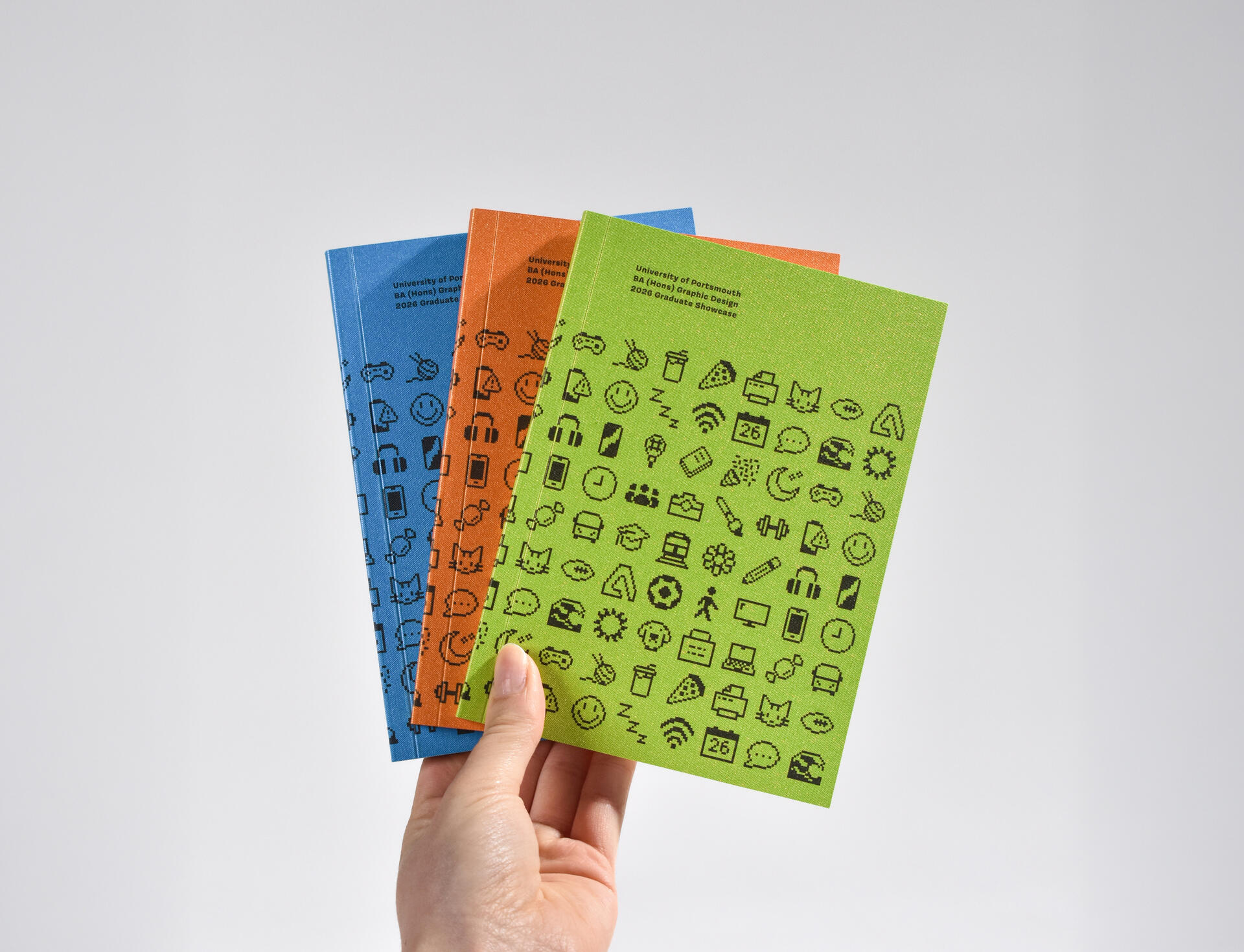
University Graduate Showcase
Catalogue and Icons
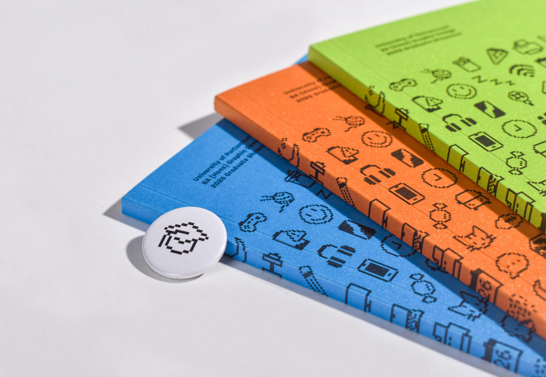
I was given the opportunity to be part of the team which came up with and designed our University Graduate Showcase 2026 identity.Every student on the course can celebrate their work, but we wanted to explore the individuality of each graduate. With this idea in mind, we decided to show connection through icons which demonstrated the things which carried us through the last three years. From friendships, late nights, coffee, or sport, every student was able to assign themselves to what got them through this degree best.Alongside giving my input to the rest of the team roles, my main responsibility was designing the icons. For these, we decided to use a 16x16 pixel canvas, linking to a retro/digital theme. Each icon was carefully thought out to make sure they all looked part of the same set. Badges were then created using these icons, allowing people to pick and choose which one they found represented them.After designing the icons, I helped the ‘layout’ team with the inside pages of the catalogue, making sure each icon was clearly represented with their appropriate description, as well as designing the concept for the front cover.I really enjoyed working with my peers to create something we are all proud of. I feel as though the fun icons and the vibrant colours bring out our individual personalities, as well as showing the connection and fun memories we made along the way.These catalogues and badges were then used as part of our Graduate Showcase and taken with us to New Blood’s D&AD festival, making sure to uphold our cohort’s unique personality and identity.
Behind the Scenes and the Creative Process
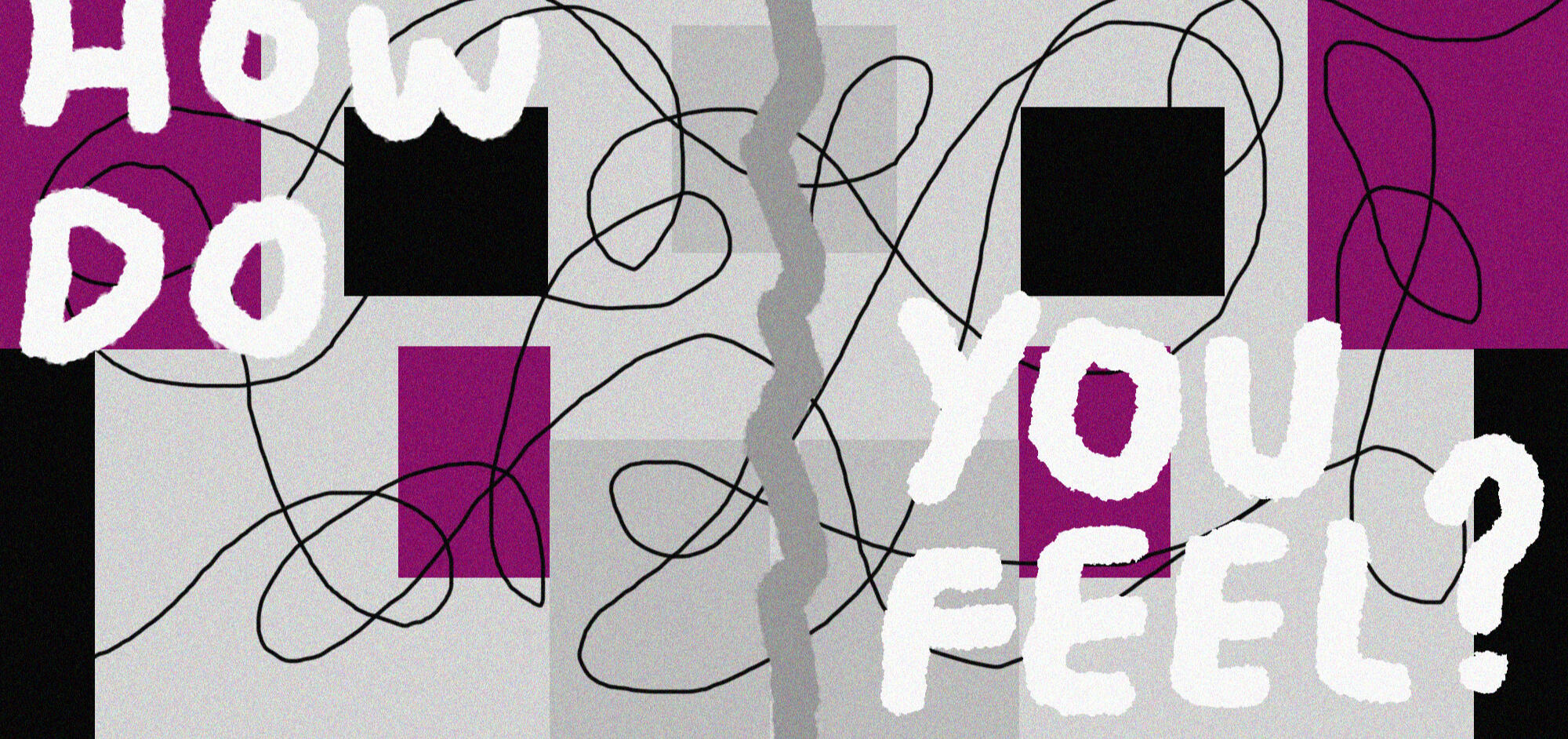
Foundation in Art & Design
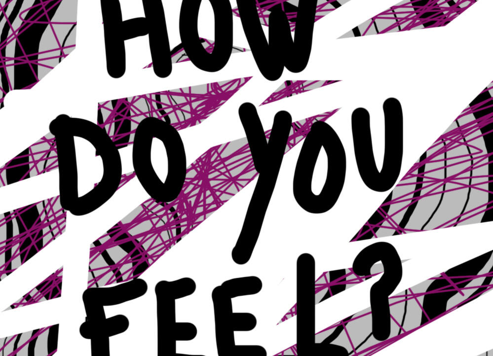
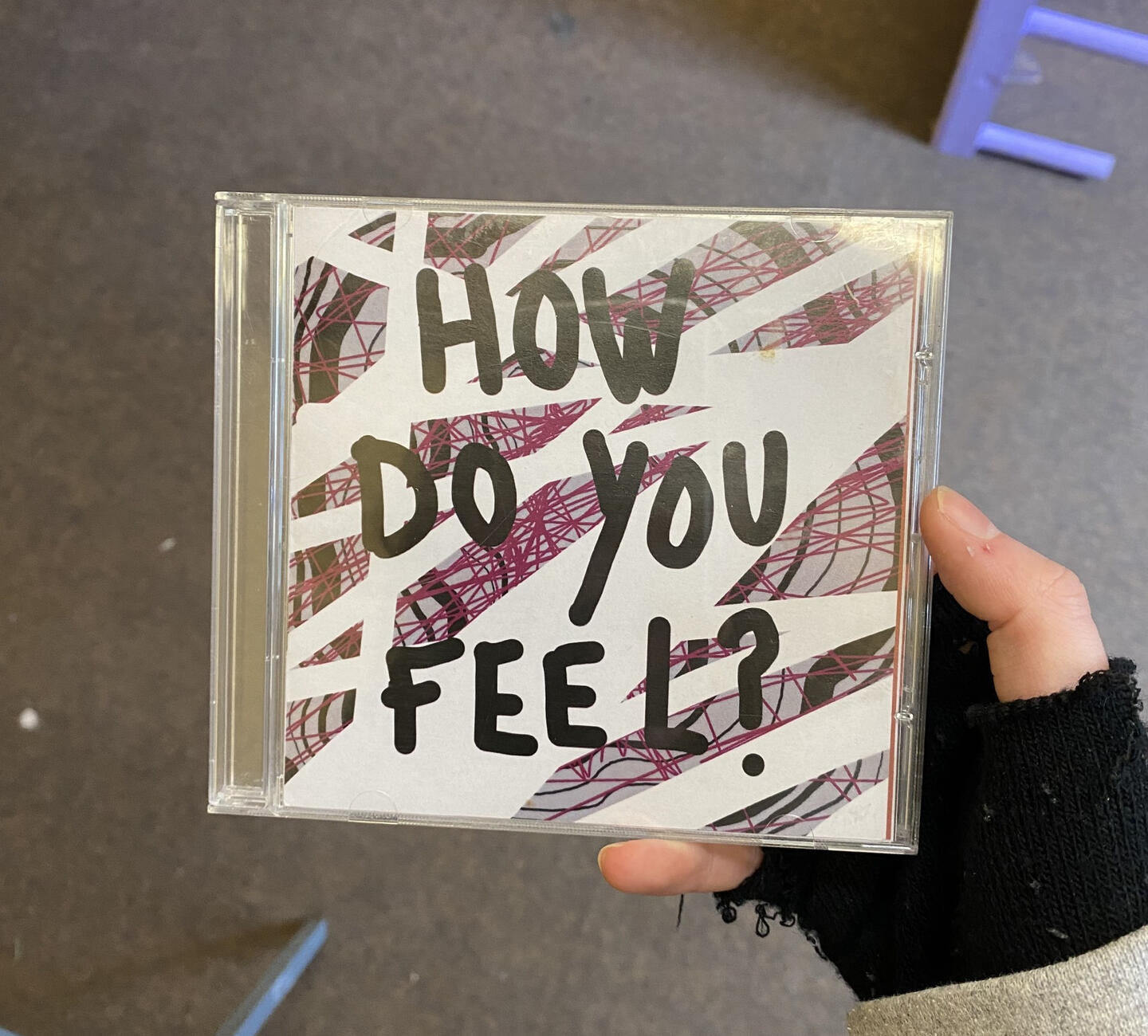
How Do You Feel?
For my foundation year at college, I created a CD album with a booklet inside and a video responding to the idea of how people feel towards music and the influence it has on people's lives.I started with looking into the idea of synaesthesia and how this corresponded to people’s emotions and personal experiences. I ended up using the shapes and colours from primary research and experiments to create unique designs associated with certain songs. I used Illustrator to create manipulated text, before thinking of how these images would be used in my final product.After deciding to compile all my designs into a CD and cover, I used my interest in video design to create an accompanying visual which I burned onto a DVD. In this video, I used primary sourced clips and a voice over, allowing the concept to come across, and for the viewer to be directly spoken to which sparked more thoughts and conversations amongst those who watched and listened.
Behind the Scenes and the Creative Process
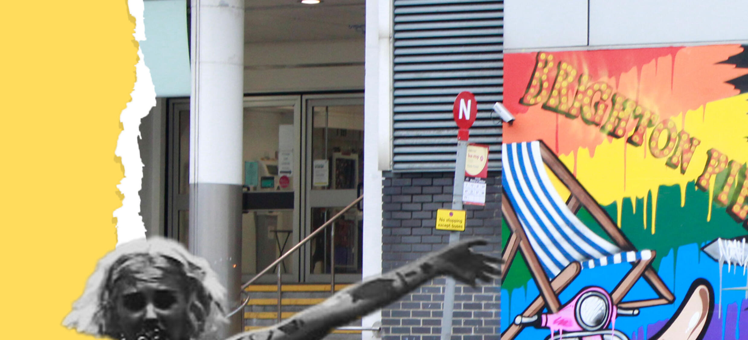
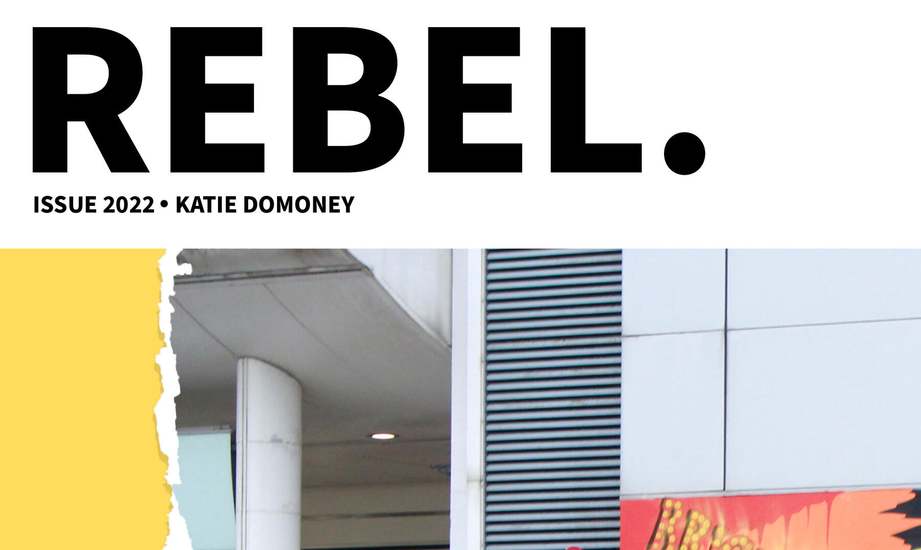
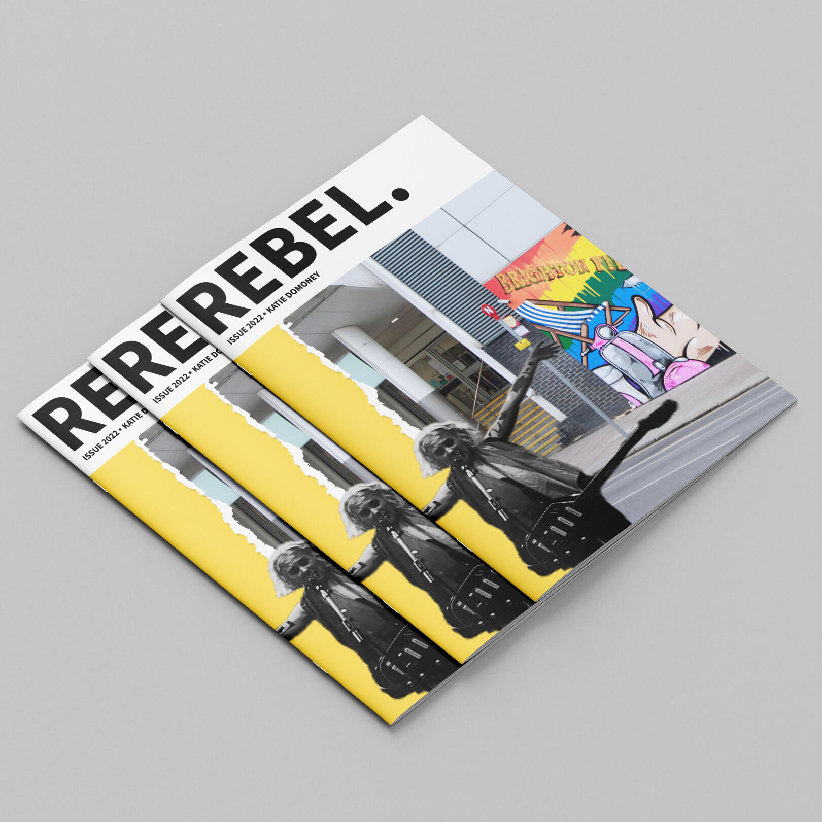
Rebel
Magazine & Video
For my Photography A Level final project, I created a magazine with a supporting video demonstrating the issues within society. I wanted to draw attention to the political, social and environmental issues of the world. I mostly used photography, but also experimented with type, illustration and other physical techniques to create the magazine.I edited the primary/secondary footage on Adobe Premiere Pro, using the audio from 'The 1975' by The 1975, from their album 'Notes On a Conditional Form', linking it to the aesthetics and content of the magazine.
Behind the Scenes and the Creative Process